Culinary Delight
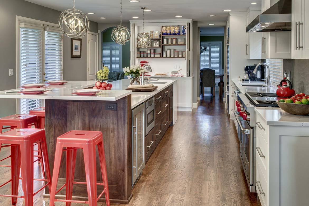
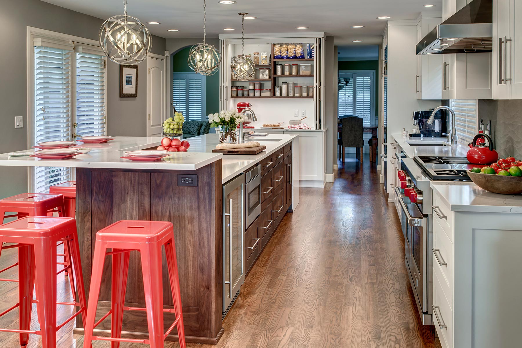
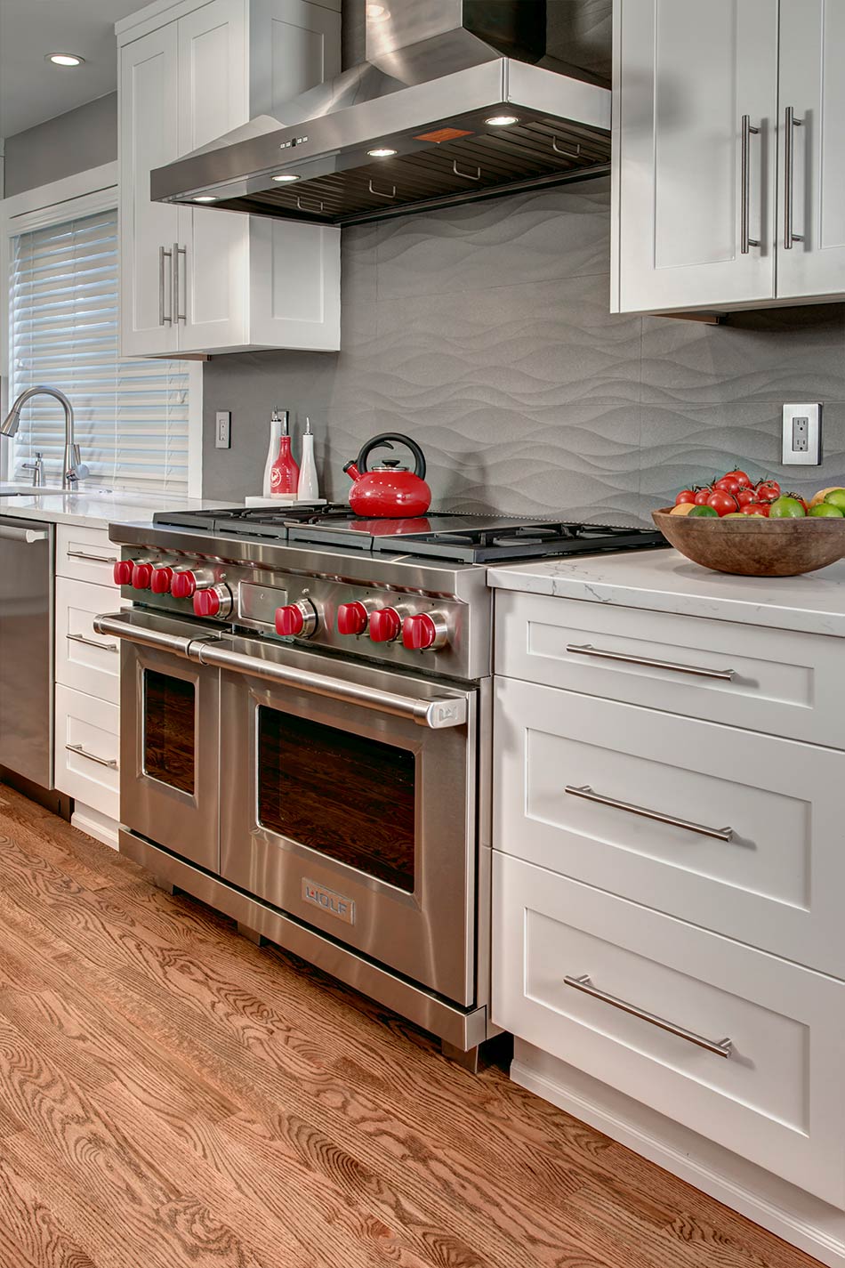
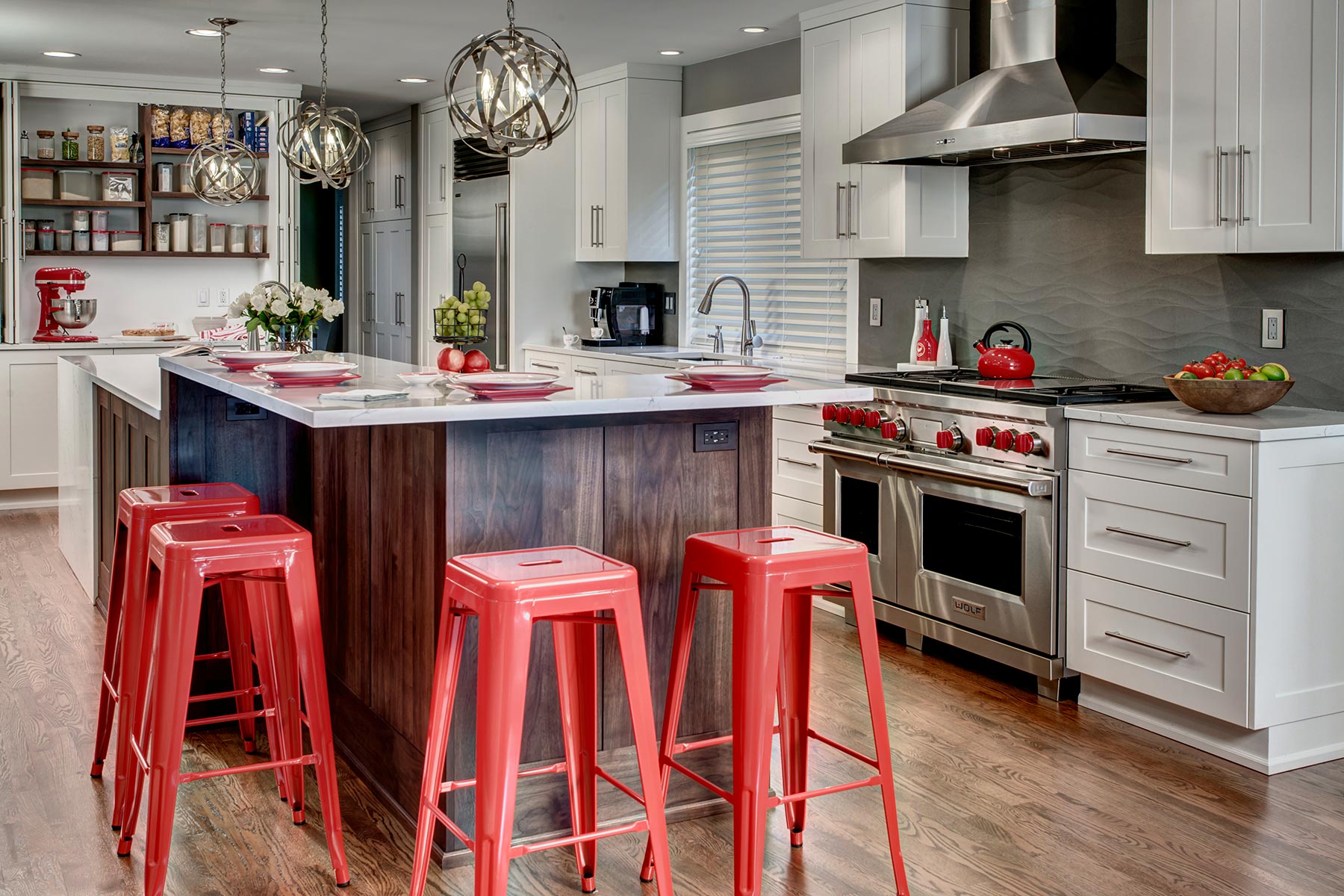
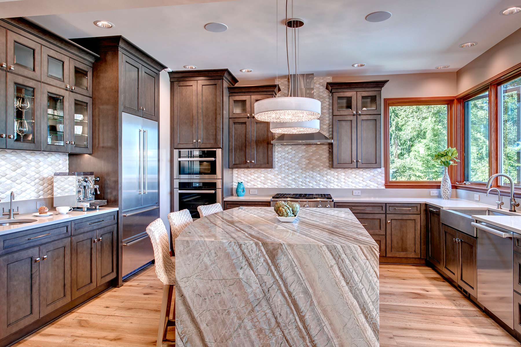
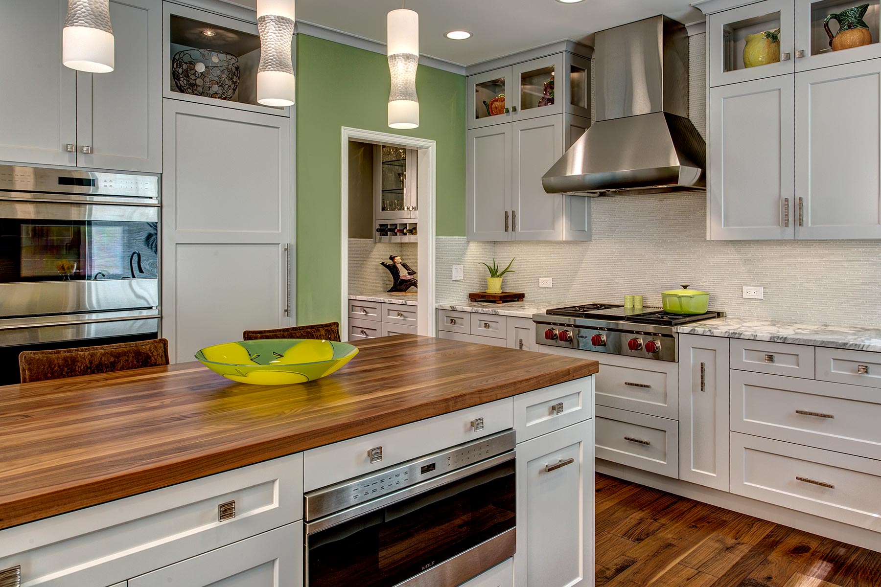
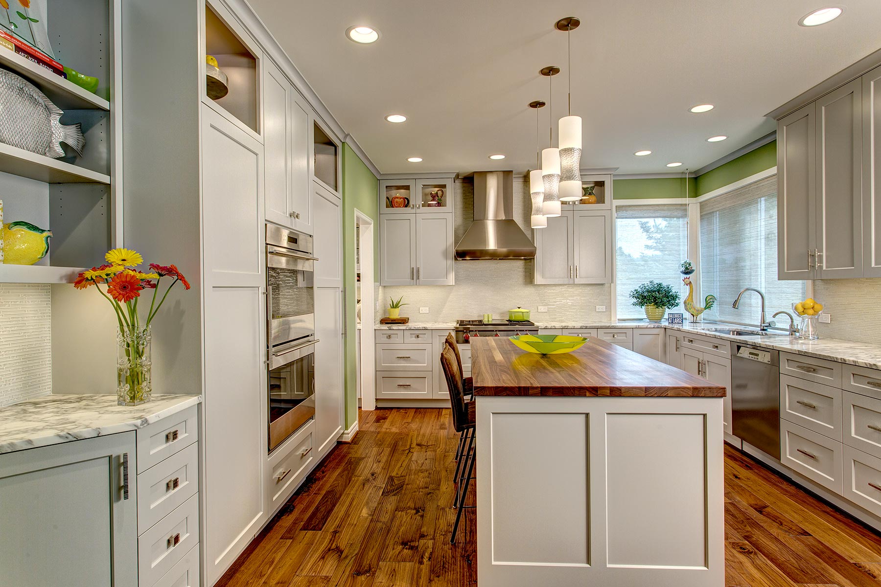
The kitchen was large, narrow, overwhelmingly brown, and ordinary. The work stations were crowded together and not optimal for two cooks: she the baker/chef, he the sous-chef. The peninsula dividing the kitchen from the family room provided seating but it was too far away from the action, and created a barrier between rooms.
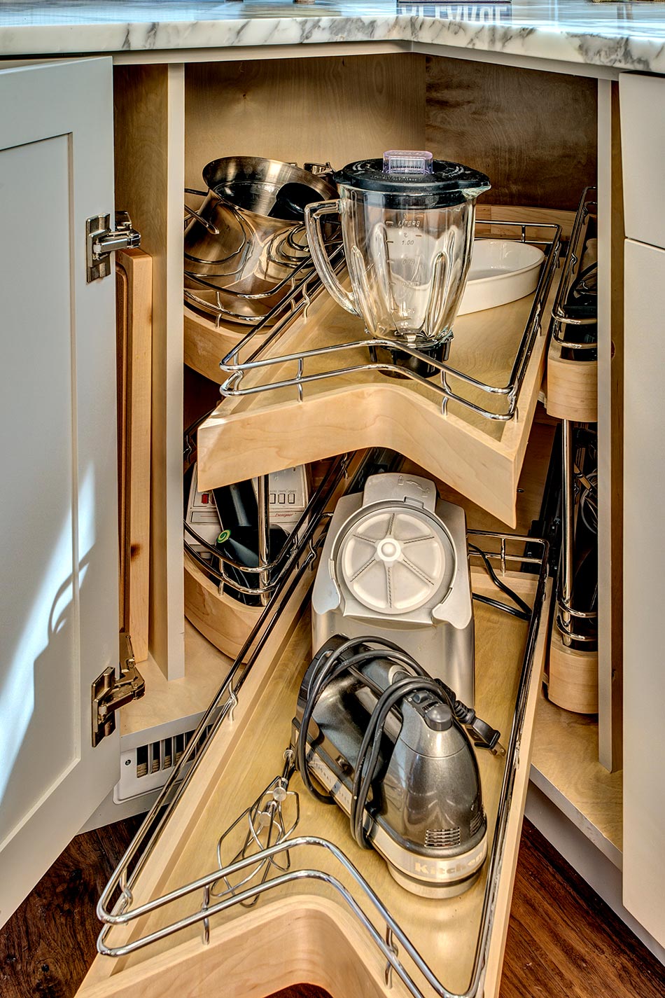
Since the owners always cook from scratch, they wanted appliances with top of the line culinary features. They longed for optimal/specialized storage, lots of individual work space, a customized baking center – all with a clean restaurant feel. This kitchen begged for an update.
- Create independent work stations
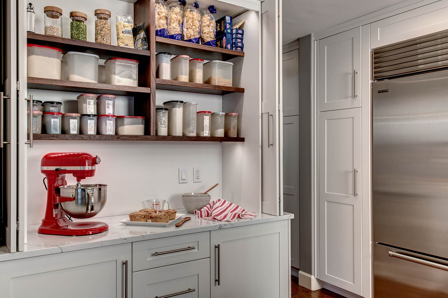
- Create separate baking center
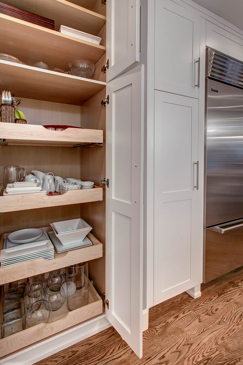
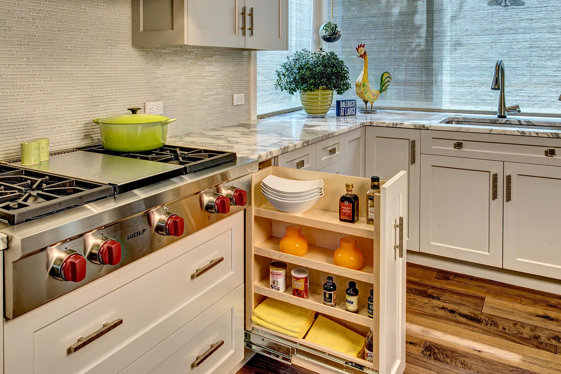
- Create specialized food storage
- Create serving/tableware storage for multiple sets
- Provide cookbook storage
- Install culinary appliances
- Remove down-draft ventilation
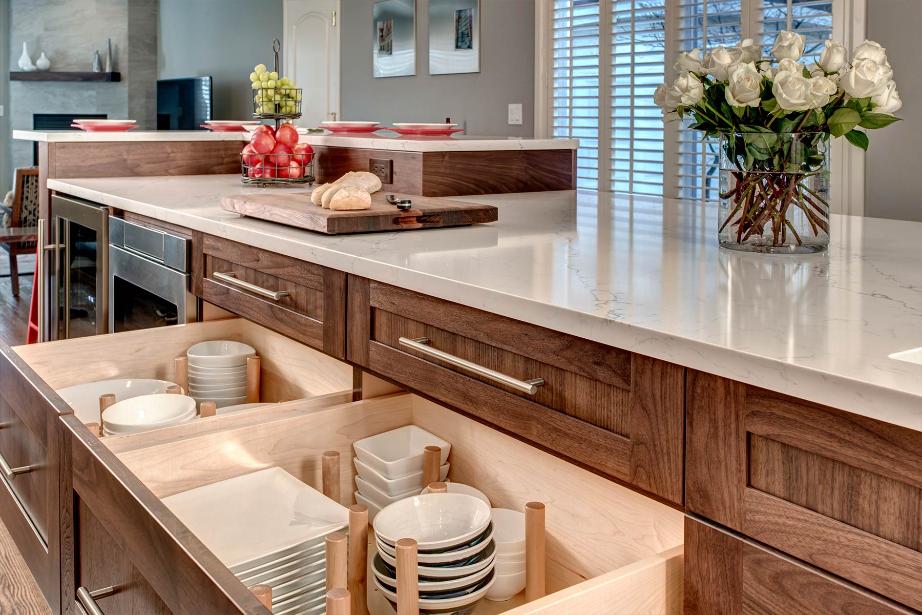
- Create very long island
- Bring seating within kitchen
- Design restaurant-like kitchen
- Design a white kitchen
- Add/improve lighting
- Long narrow space
- Creating restaurant-like kitchen that flowed with the rest of the home
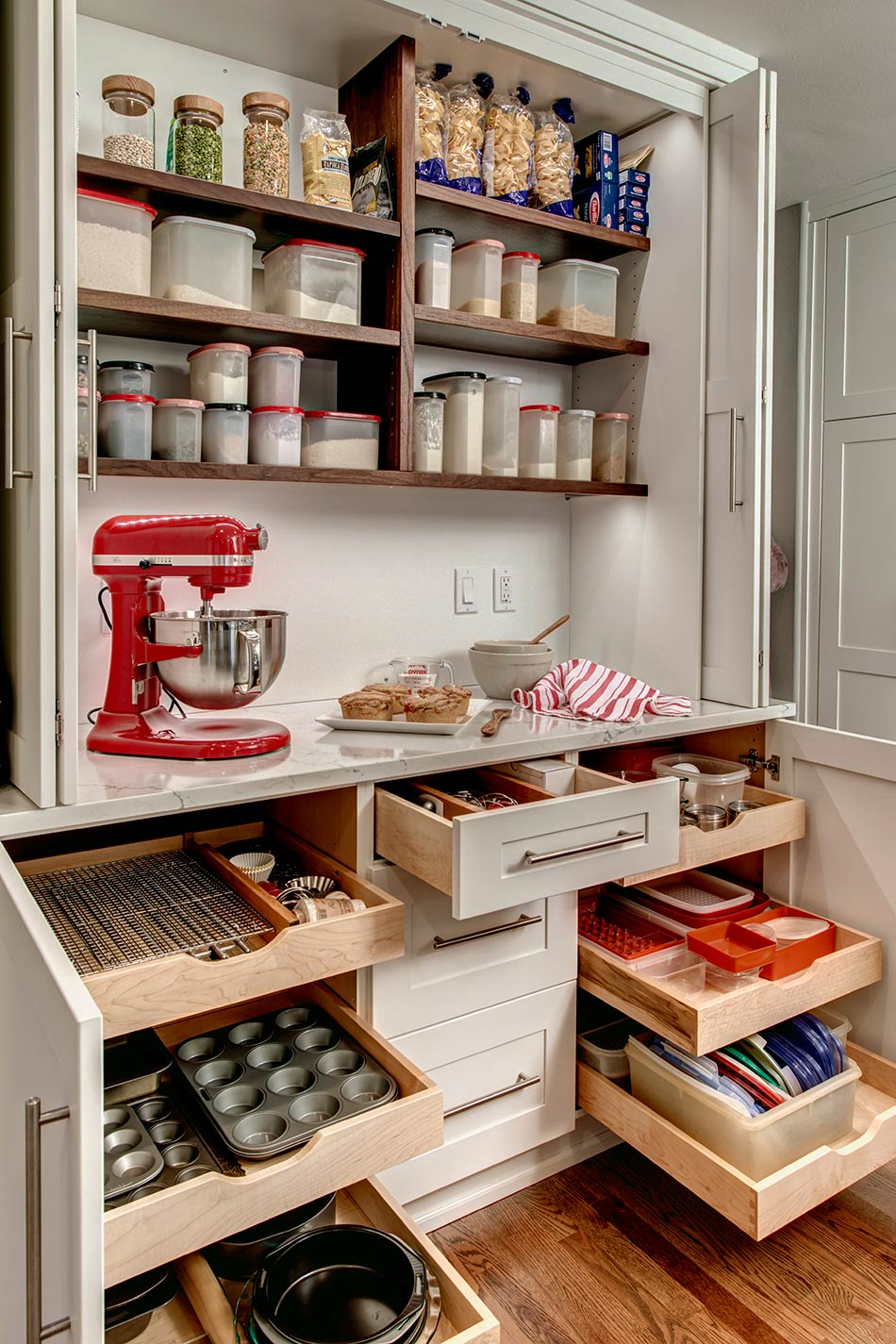
- Creation of self-enclosed custom baking center
- Limited wall space
- Designing 15½’ long island
- Installing electrical plates in dimensional tile
- Expanding pallet
- Construction
- Removed peninsula to open up kitchen to family room
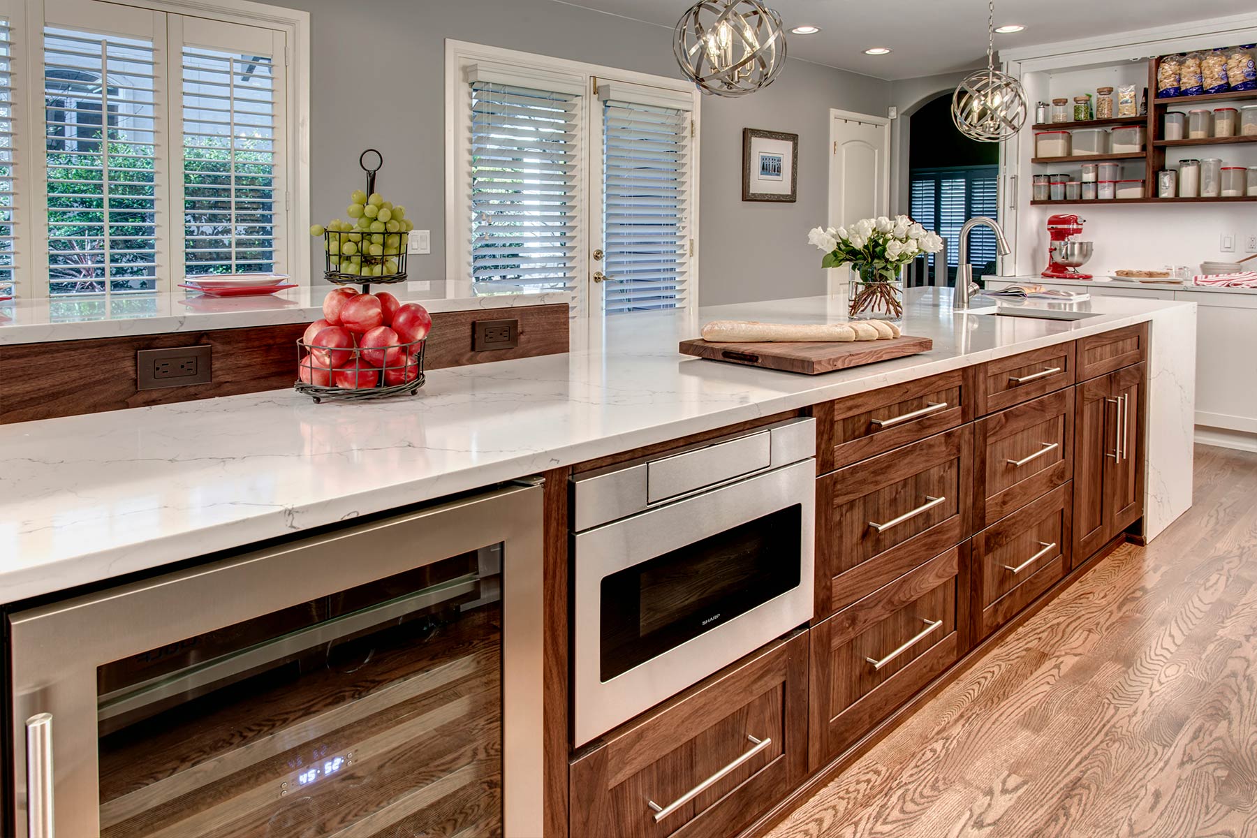
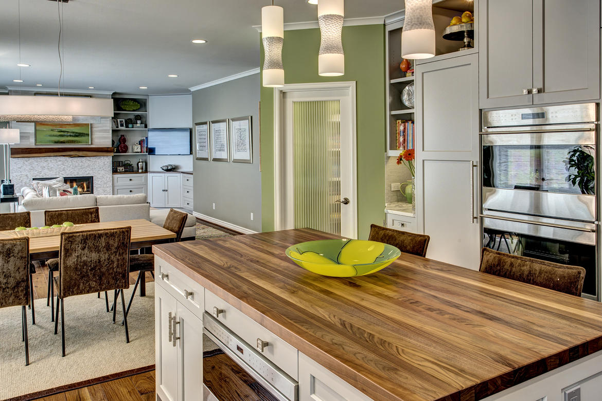
- Created long island for multiple work stations
- Raised seating adds dimension to island
- Added seating along island to face sink wall
- Relocated appliances to improve work flow & range ventilation
- Used capacity in island to make-up for limited wall space
- Selections
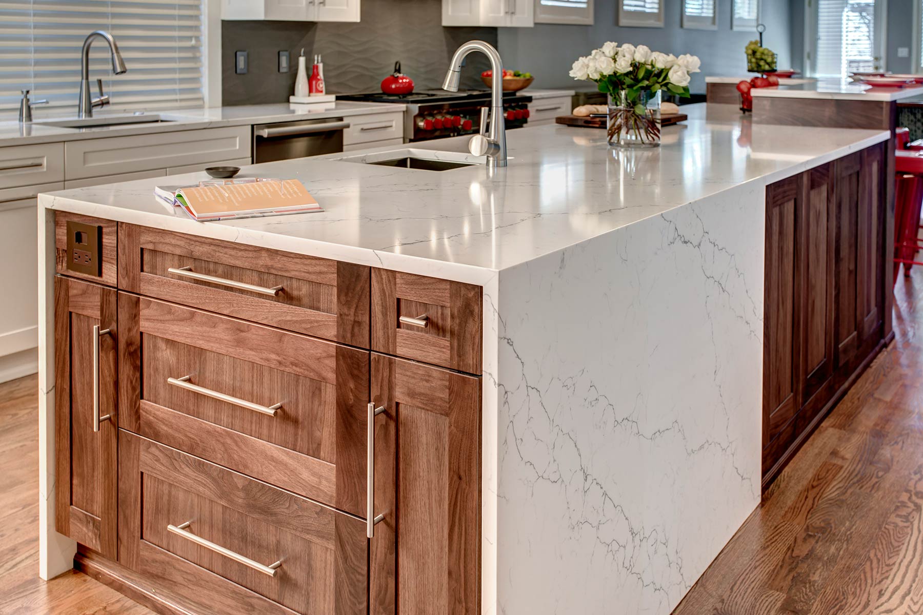
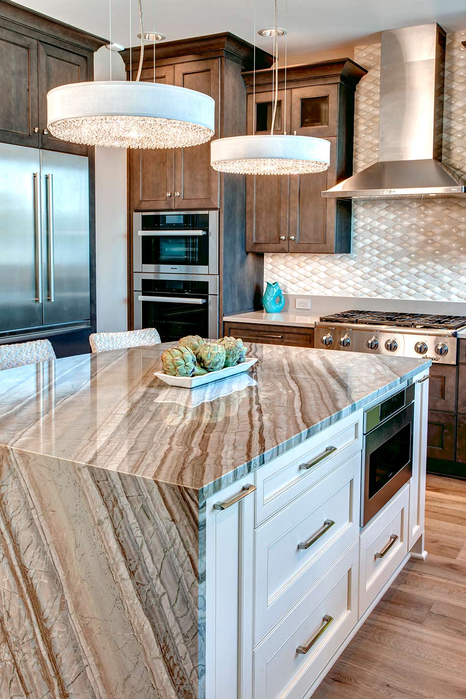
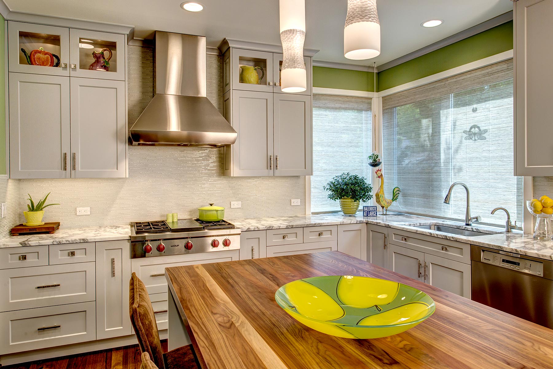
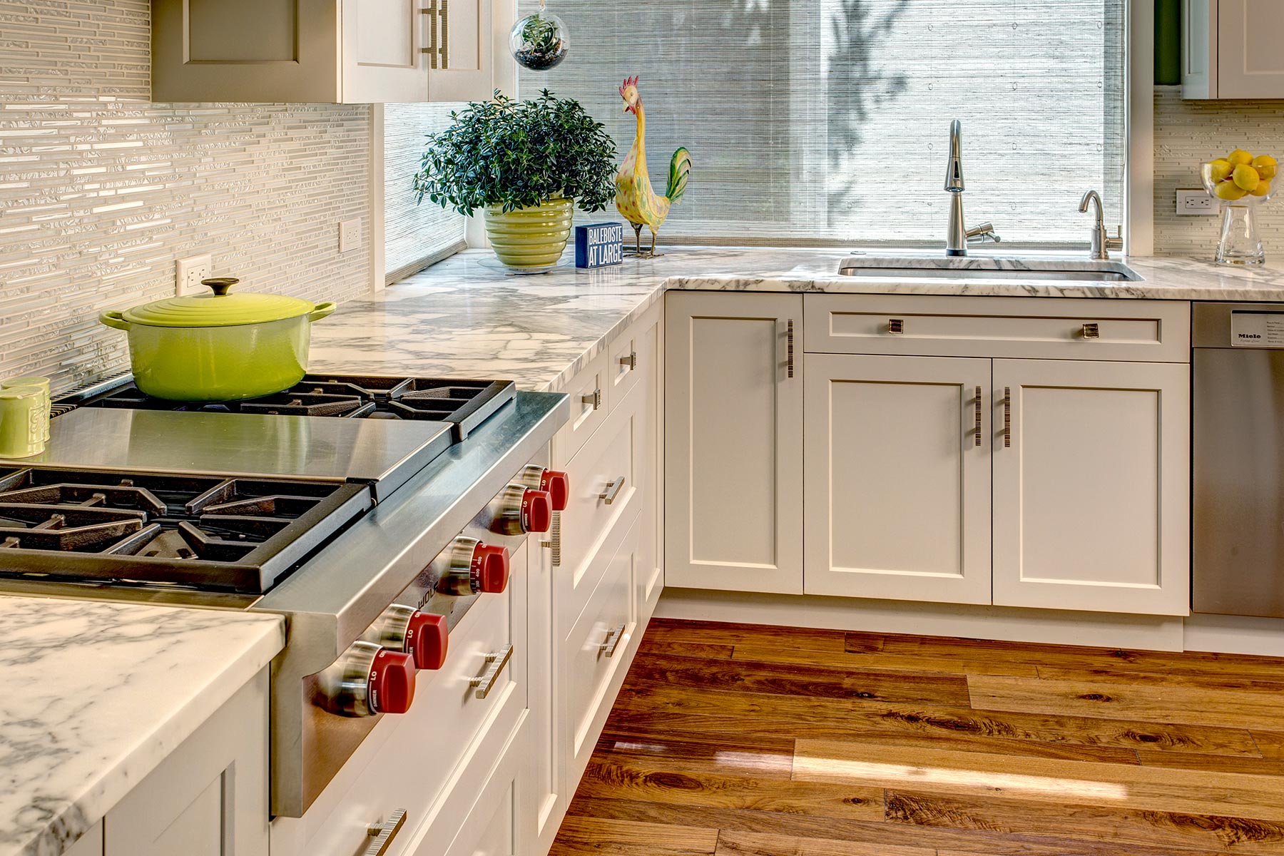
- Simple white perimeter cabinets juxtaposed with rich walnut grain island cabinets which provide richness & softening
- Dimensional wall tile to soften the length of kitchen
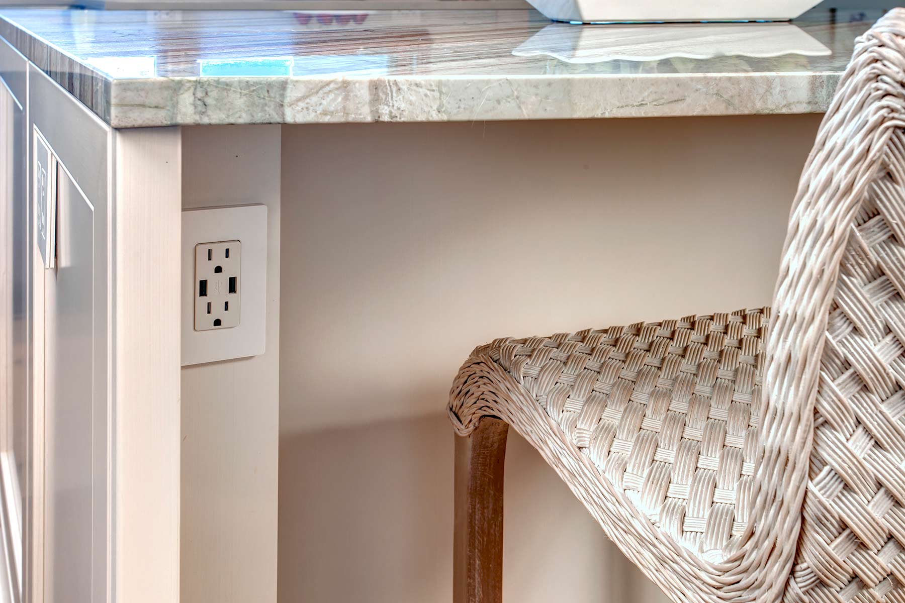
- Use coordinating non-dimensional tile at electrical locations so plates fit tightly
- Miter the edge of dimensional tile to create a perfectly aligned wave edge (as Schluter would look awkward)
- Refinish oak flooring with “walnut-like” stain color
- High-end culinary appliances
- Custom baking center
- Prep sink
- Professional grade appliances
- Accent with red accessories
- Electrical
- Under-counter LED lighting highlights dimensional tile; adds task lighting
- Lutron outlets, switches, USB charging in Lutron brown to blend with walnut
- Metallic ribbon globe chandeliers to offset the linear elements
- Incorporate light switches/outlets into cabinetry
- Increase recessed lighting, change to LED, add dimmers
- Vent timer
- Light dimmers
- Cabinetry
- Increased & customized storage
- Changed butler’s pantry to full-height storage
- Ergonomic, simple hardware
- A place for everything
- Cookbooks hidden behind touch latch doors
- Counter
- Quartz for durability
- Soft marble-like pattern to ease the linear aspect of kitchen
- Waterfall on two sides of island with different dimensions for interest & to break-up island length
- Change out window sill to quartz for durability
- Social Impact
- Recycled all cabinetry, appliances, fixtures (resale & charity)
 Awards
1st Place – Large Kitchen from NKBA Puget Sound Chapter.

Gail’s favorites: Custom Baking Center, Long Island, Dimensional Tile, Clean Lines
Sparkling Waterfront/Party Pantry
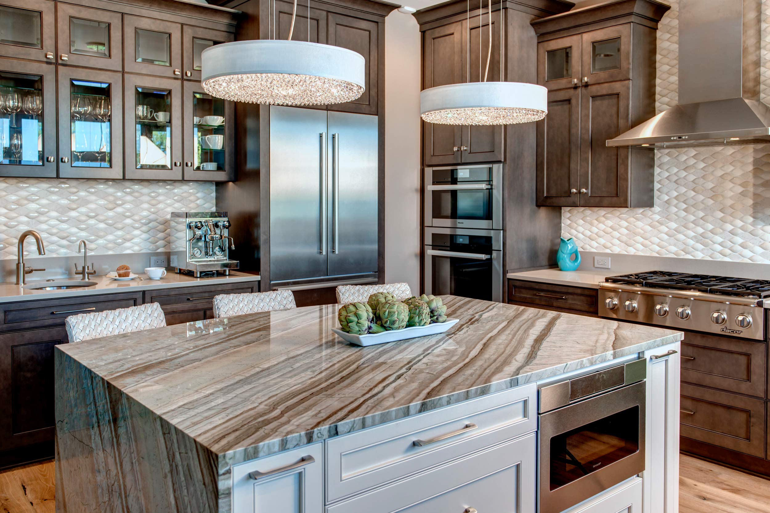
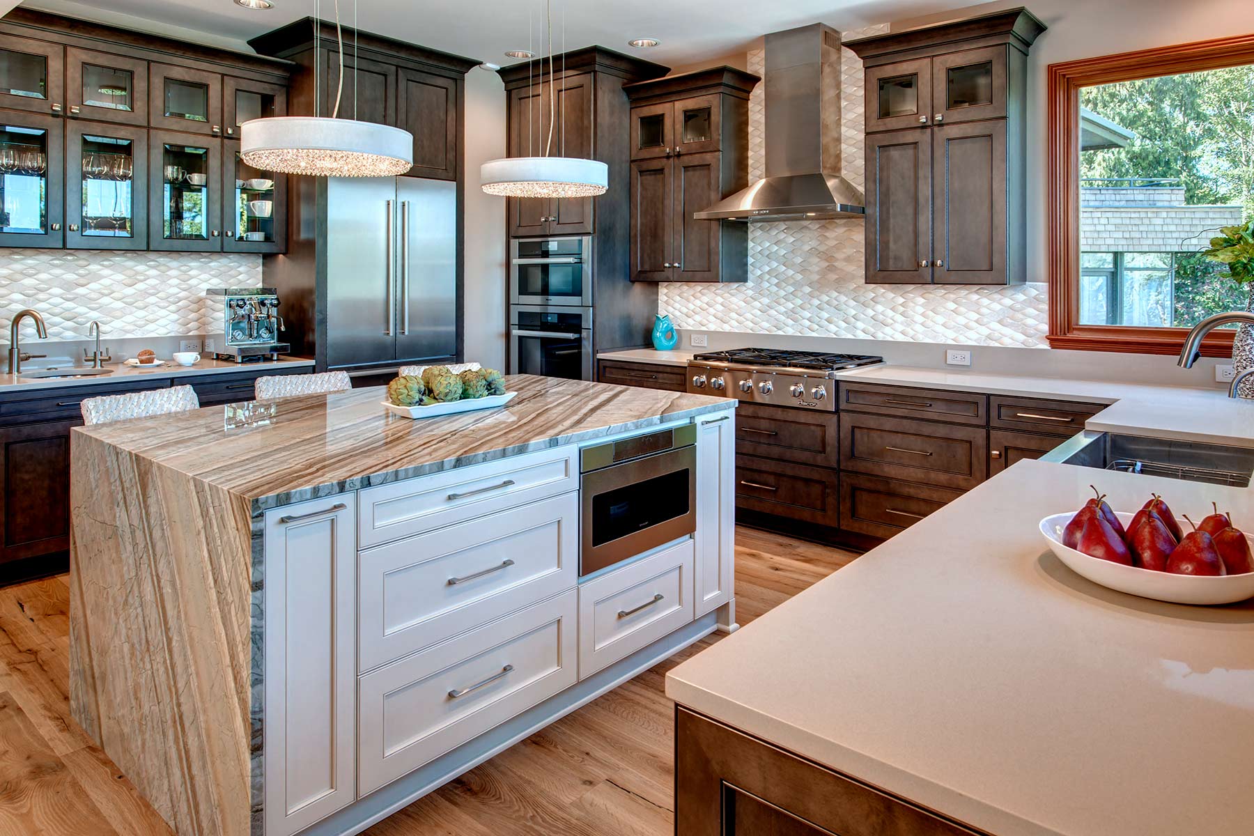
Built in 1937 as a waterfront cottage, this home has endured multiple additions and remodels and eventually the kitchen was located in the middle with no view – a dark, narrow, dysfunctional 1970’s space. The owners requested a $50,000 renovation to make it more palatable until they could undertake a full home remodel in 5-7 years. After viewing several stop-gap designs, a financial analysis of renovating along with a proposed kitchen addition cost & renderings were presented. After careful reconsideration, the strategy was altered, and the addition for a new kitchen was approved!
-
- Larger kitchen
- Maximize views
- High-end appliances
- Move range top off island
- Two dishwashers
- Improve traffic flow
- Healthy, expedient cooking
- Island seating
- Entertaining kitchen
- Open to living room
- Coffee bar
- Carbonated Water
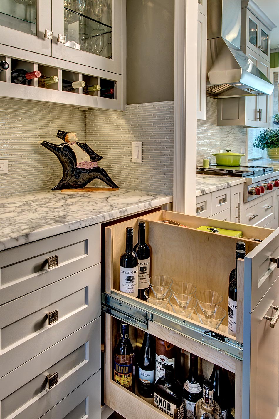
- Wine storage
- Pantry storage
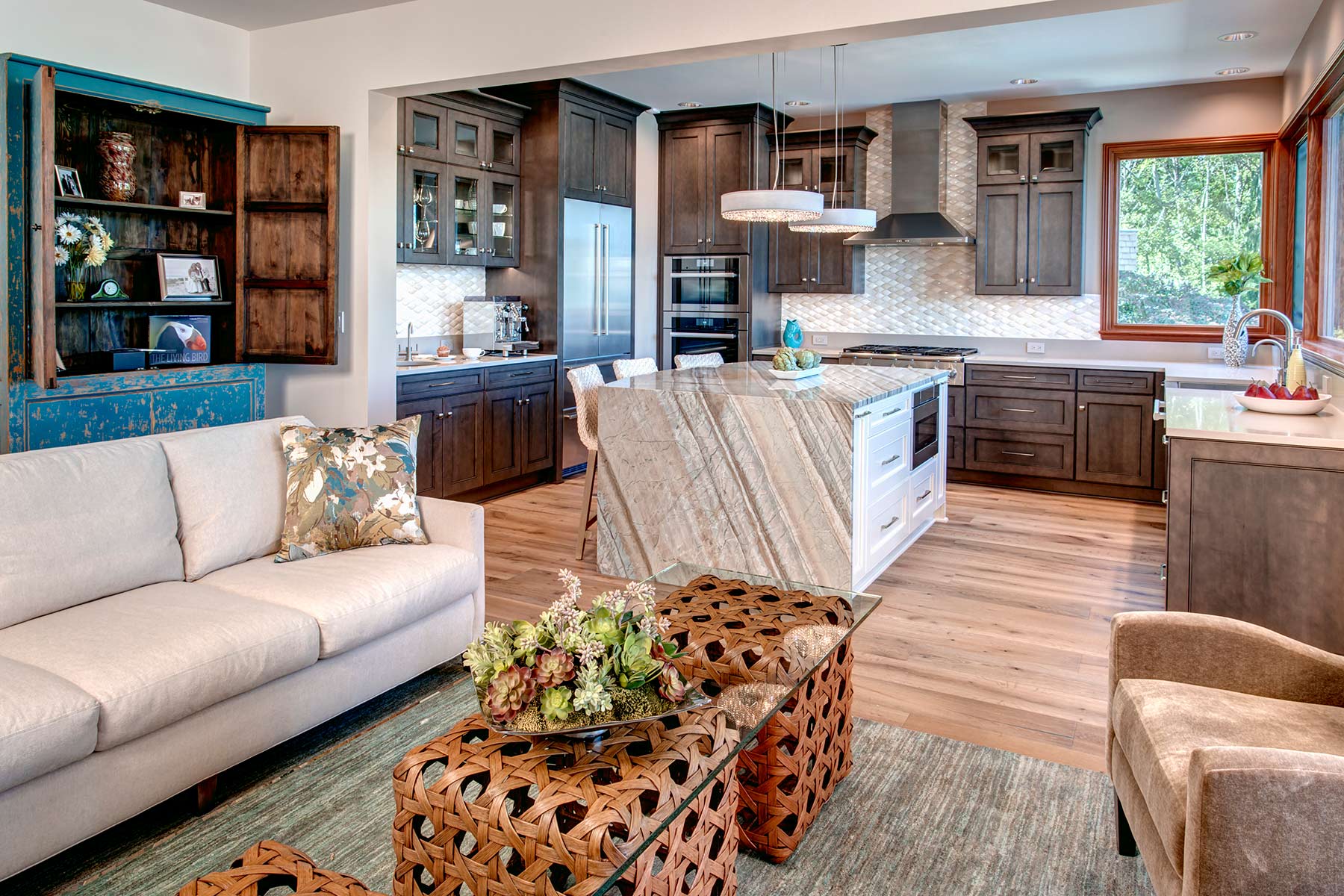
- Unique stone for island counter
- Glittery items
- Beach-like, lake feel
- Lot set-back limitations
- Maximizing view
- Lack of wall space
- Microwave location
- Room for filtered/sparking/chilled water system below sink
- Integration with living room
- Coordination with original fir trim
- Unique granite stored for 5 months (around which the entire project was designed) was damaged in fabrication three weeks before project completion
- Construction
- Worked with architect to maximize footprint & comply with set-backs
- Designed one kitchen wall partially over existing portico to add needed inches to coffee bar
- Moved wine storage out of kitchen – added wine cellar in basement
- Moved pantry out of kitchen – converted part of old kitchen into pantry
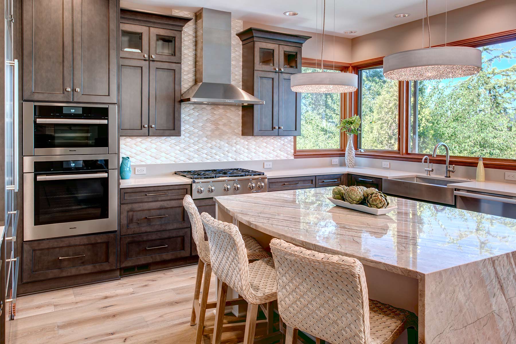
- Installed wood casement windows with built-in retractable screens overlooking pool & lake on two walls
- 15% larger kitchen feels even larger due to space planning & shape
- Selections
- Quartz counters on perimeter
- Dimensional backsplash wave tile to simulate water and add glitter
- Low quartz 5” backsplash for easy maintenance & outlet placement, topped with dimensional wave tile
- Wire-brushed, light oak hardwood floors for beach-like look/li>
- Low profile chandeliers with crystals
- Miele high efficiency 240-volt DW for 25-minute washing/drying (not room enough for two dishwashers)
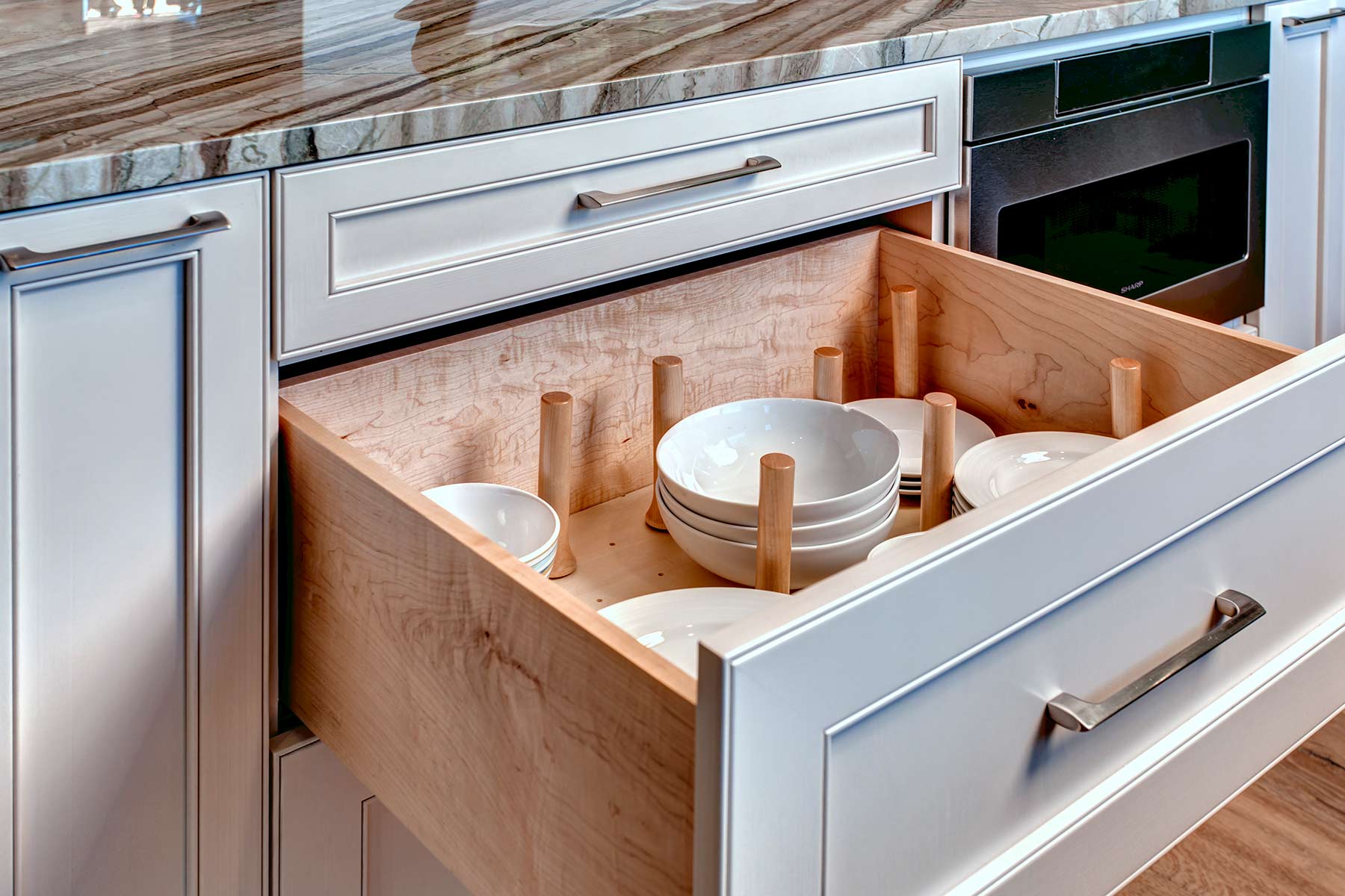
- Drawer microwave in island
- Neutral colors to blend with rest of home
- Electrical
- Under-counter LED lighting
- In cabinet LED lighting for glass door cabinets
- Lutron outlets, switches, USB charging in Lutron colors to coordinate
- LED recessed lighting; dimmers
- Ceiling speakers
- Steam oven – plumbed
- Plumbed-in espresso maker
- Cabinetry
- Dark Stained perimeter cabinetry frames unique island stone & coordinates with fir trim
- Custom coffee center
- Increased & customized storage
- Drawer peg systems for dish storage
- Counter
- Quartz
- Emergency sourcing: replacement for unique island granite damaged during fabrication (many client tears)
- New quartzite island slab found; result – better liked than original selection (smiles)
- Social Impact
- Recycled all cabinetry, appliances, fixtures (resale & charity & friends)
- Special Features
- Quartzite waterfall island
- Chandeliers
- Wave tile
- Coffee bar
- Sparkling water faucet
- Built-in retractable window screens
- Hardwood floors
 Awards
In 2017 this project was awarded: MBA/T-REX Award – Major Remodel Excellence Partial House / Addition – more than $250,000; Puget Sound Chapter NKBA 2nd Place – Other Room Party Pantry and the Coolest Detail for the waterfall island; and a Chrysalis Residential Specialty.



Gail’s favorites: Wave Tile, Island Chandeliers, Quartzite Waterfall, Coffee Bar, Chandeliers
Interlude to the Garden
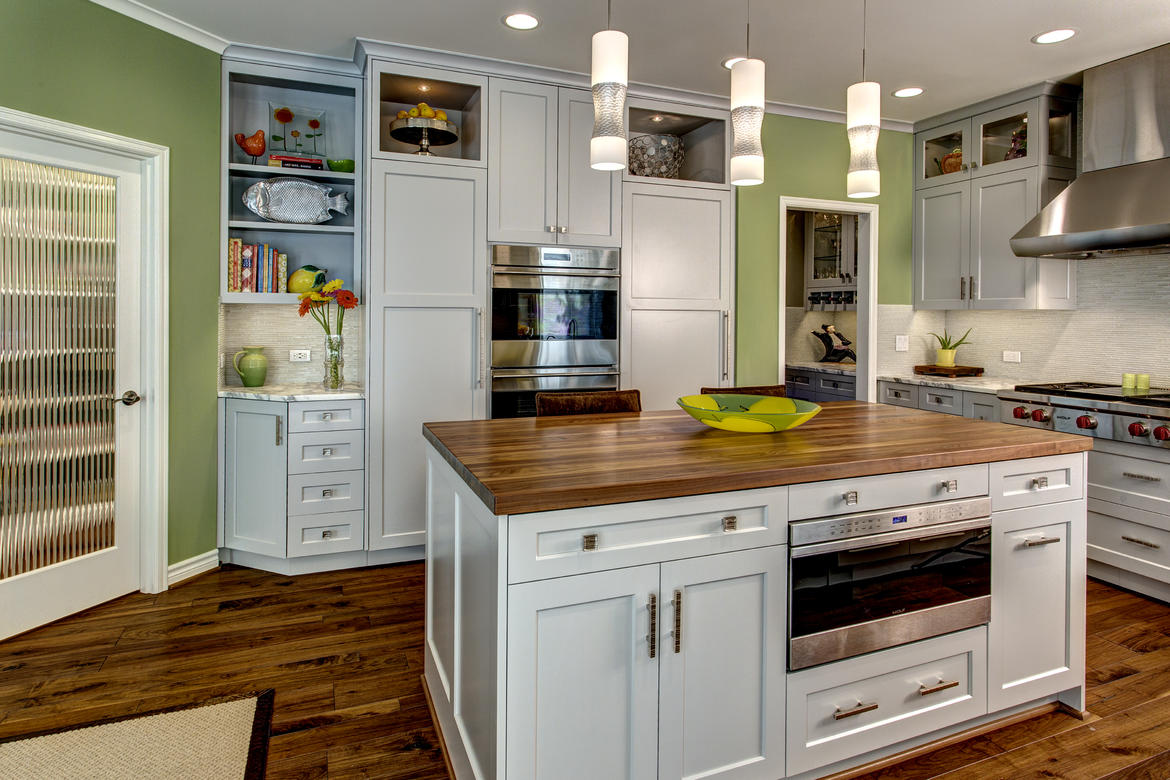
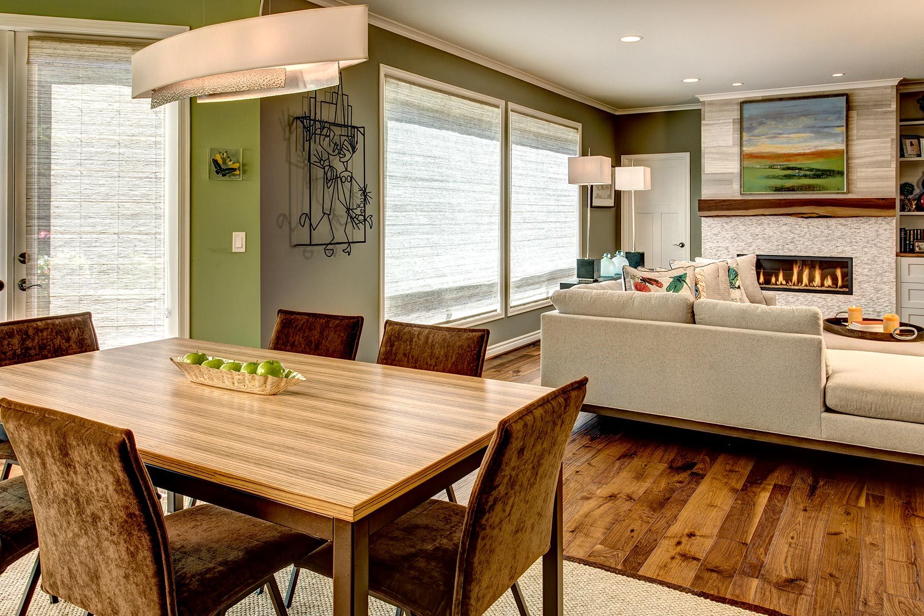
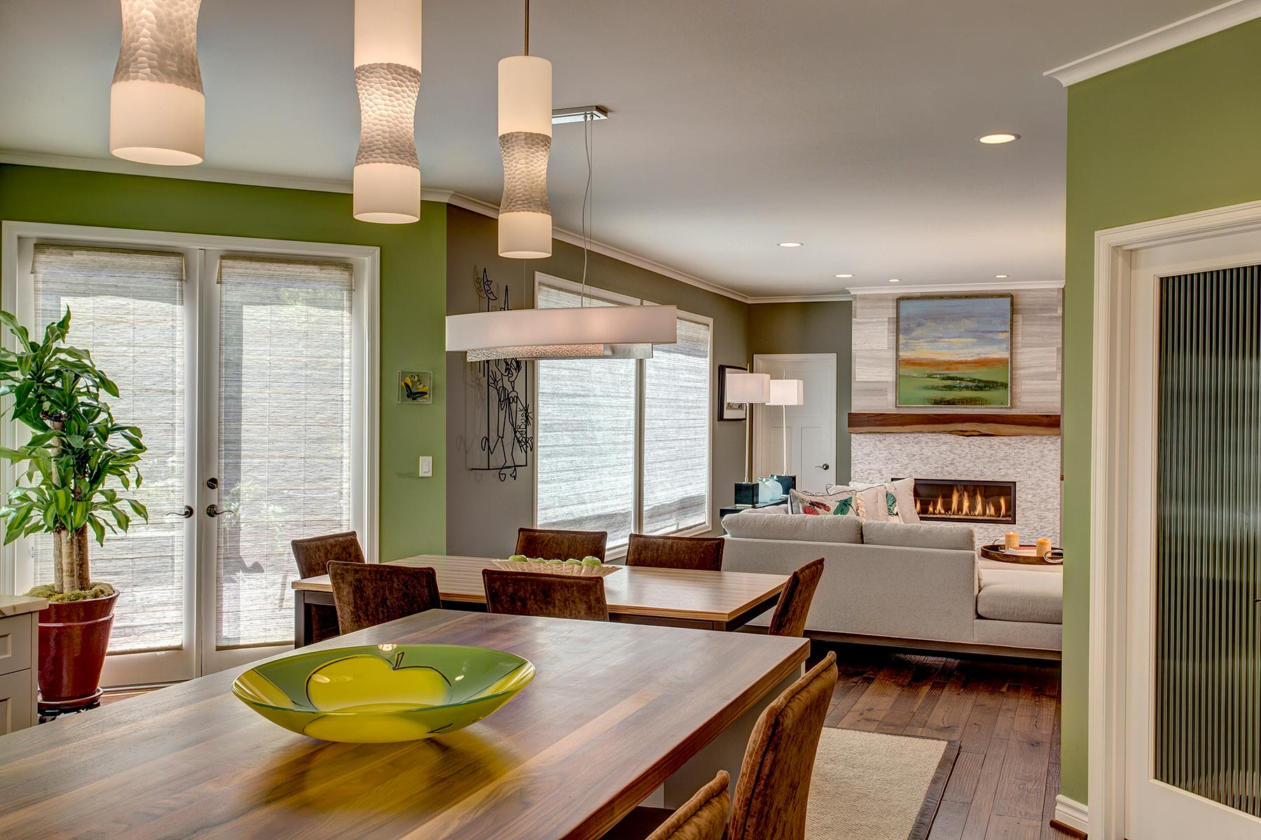
The kitchen in this home featured dark cherry flooring/cabinets and dark cherry counters & backsplashes. The extensive amount of wood (in that color) felt oppressive and closed-in to the homeowners. The cabinetry was standard builder grade with no storage accessories. The overall dark tone continued into the butler’s pantry, and through the dining room to the family room.
- Light, bright and colorful
- Reflect outdoors/nature
- Blend with rest of traditional home
- Quiet appliances, updated culinary appliances
- Lower kitchen counters (existing H = 38”)
- Improve traffic flow
- Improve lighting
- Expand scope to include butler’s pantry & family room
- Longer art wall/Less shelves in family room
- Creating a unified design vision with clients
- Existing electrical ghost issue to solve
- Existing counter of H=38” was driven by location of existing corner windows; Need to reset corner windows for H=36”
- Creating a contemporary design within a traditional home
- Electrical outlet to left of new sink location to meet code (no backsplash, windows meet counter)
- Took extra time with clients learning their likes and dislikes to support vision development
- Created multiple sets of renderings to reach the vision
- Incorporated existing metal art (anniversary gift) into the design scheme
- New flooring: multi-width hand-scraped walnut (connecting to outdoor trees)
- Defined a dominant color of green (connecting with outdoor landscape)
- Custom walnut island top taken into family room cabinetry counters (thus continuing the contemporary wood feel)
- Split the built-in refrigerator & freezer units creating a better visual, more useable volume and more space between island & fridge
- Moved sink off diagonal at windows: increased work flow and added a pop-up outlet at window corner to meet code
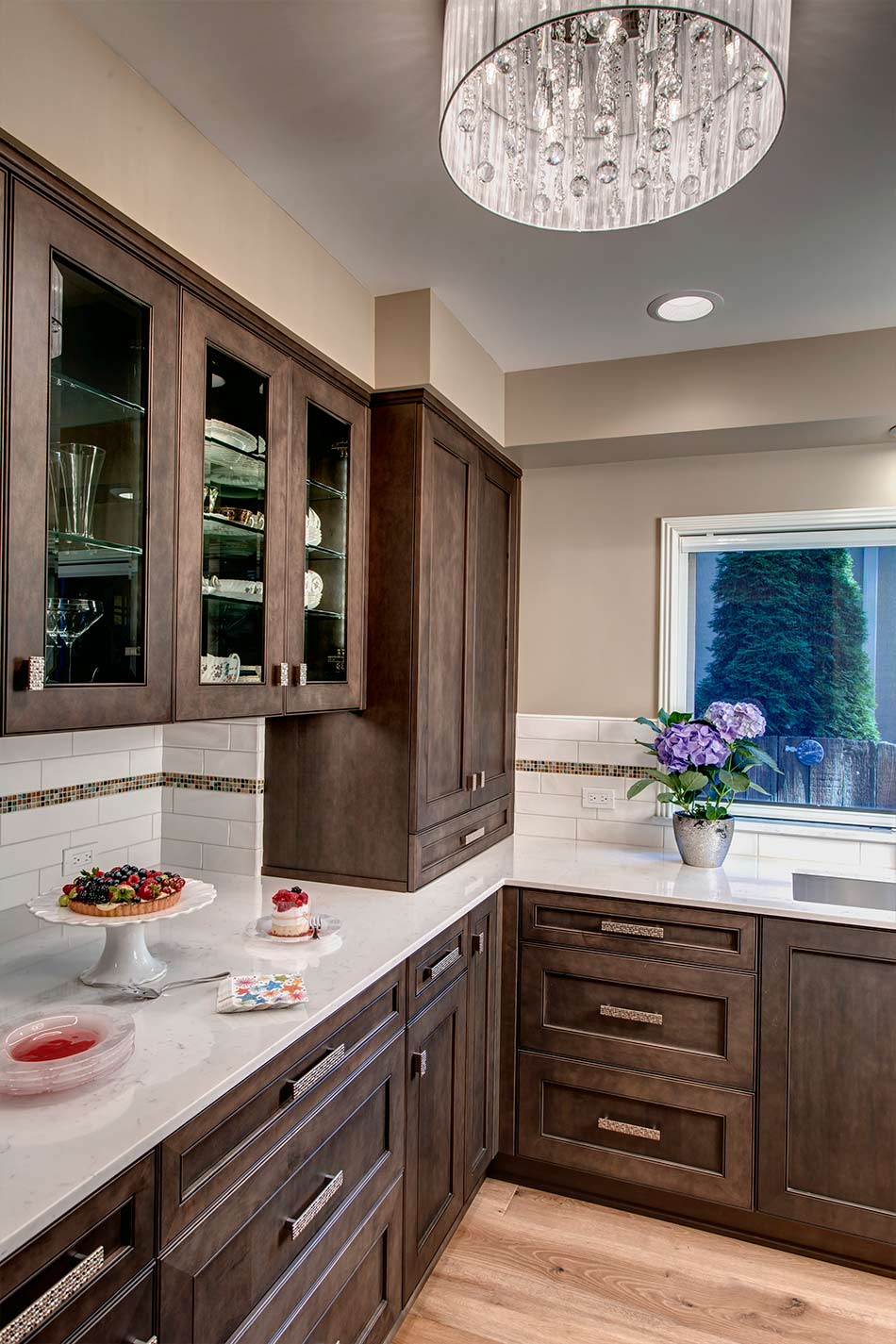
- Decorative cabinet hardware that is unique and mimics stone look
- Quiet disposal & dishwasher
- Coordinated pendants with chandelier using hammered metal
- Compromised with new counter H = 36.75” allowing design to keep window locations
- Custom live edge walnut mantel, creating a soft contemporary tone
- Fireplace stone mimics marble counters in kitchen as well as stone wall in exterior garden
- Linear fireplace with glass crystal tile, adding a warm glow
- Took one set of shelves out of family room (reducing cabinetry) and replaced with extend art wall
- New furniture with a light and spacious tone
- New Rug in recycled wool/every color in the rainbow
- Troubleshot electrical ghost: hot tub wiring/ground
 Awards
In 2016 this project received 2 awards MBA/T-REX Award – Major Remodel Excellence Partial House / Addition – $100,000 to $250,000; Puget Sound Chapter NKBA 2nd Place – ‘Open Floorplan Kitchen’


Gail’s favorites: overall color pallete, hand-scraped walnut floors, custom walnut island, custom live-edge walnut mantel, marble counters, hammered metal light fixtures/hardware
Light and Airy
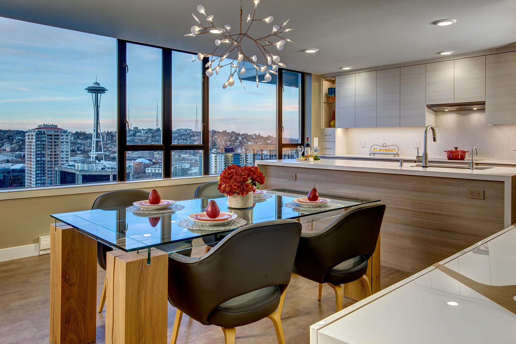
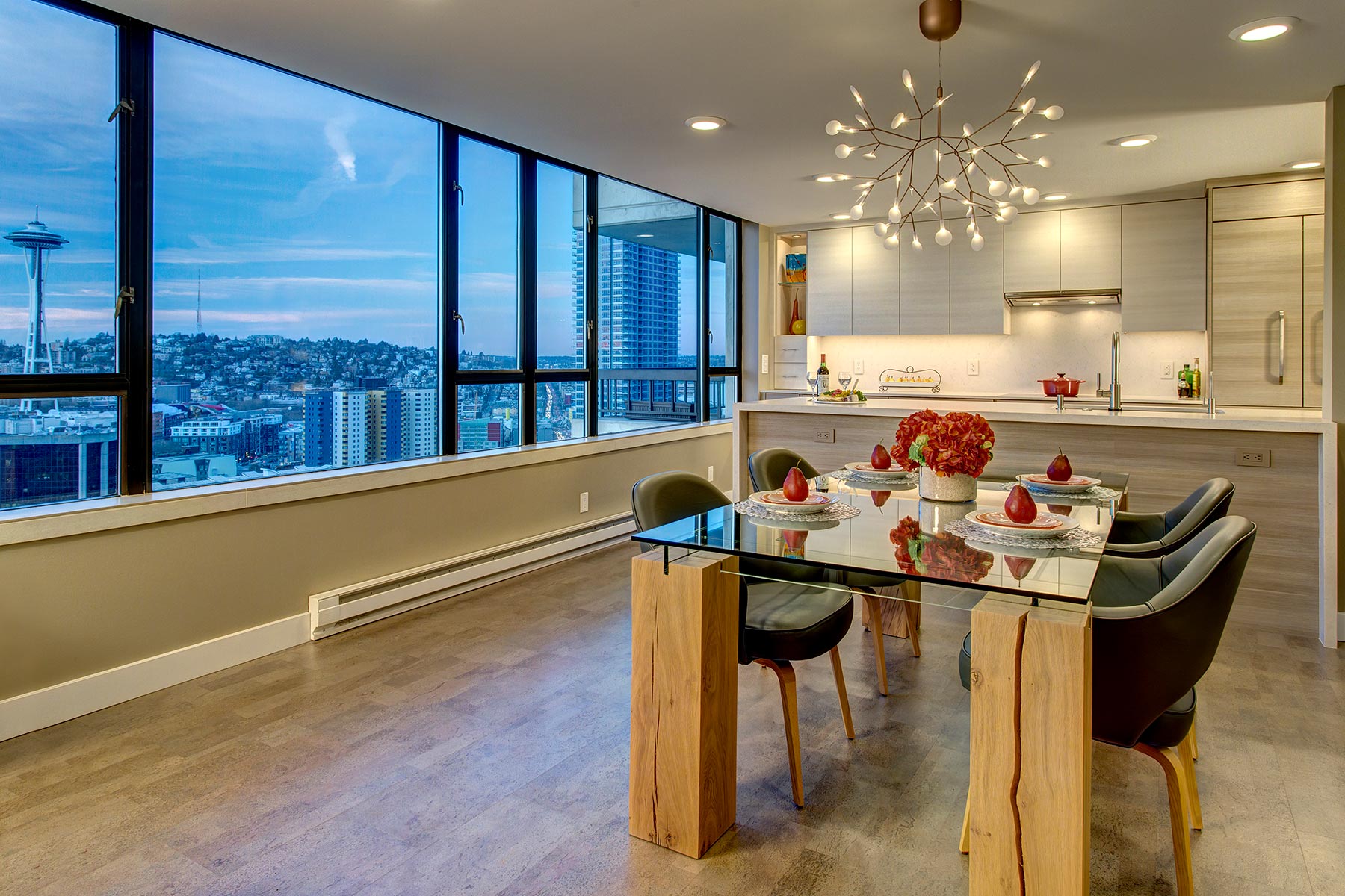
This 24th floor condo featured a wall of windows providing a flood of daytime light, which is a lovely asset, but a wall dividing the kitchen from the dining area partially obstructed the view. The styling was very dated using traditional cherry cabinets, dark granite and a lowered ceiling. With a semi-functional layout this created a kitchen environment that felt dark and uninviting.
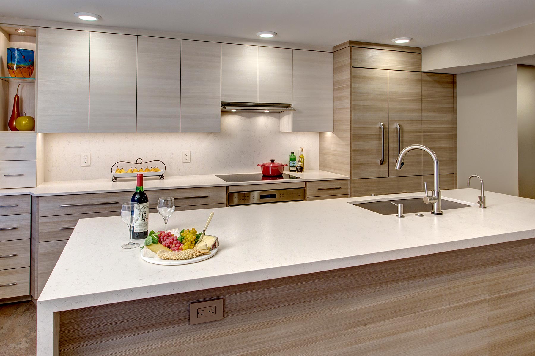
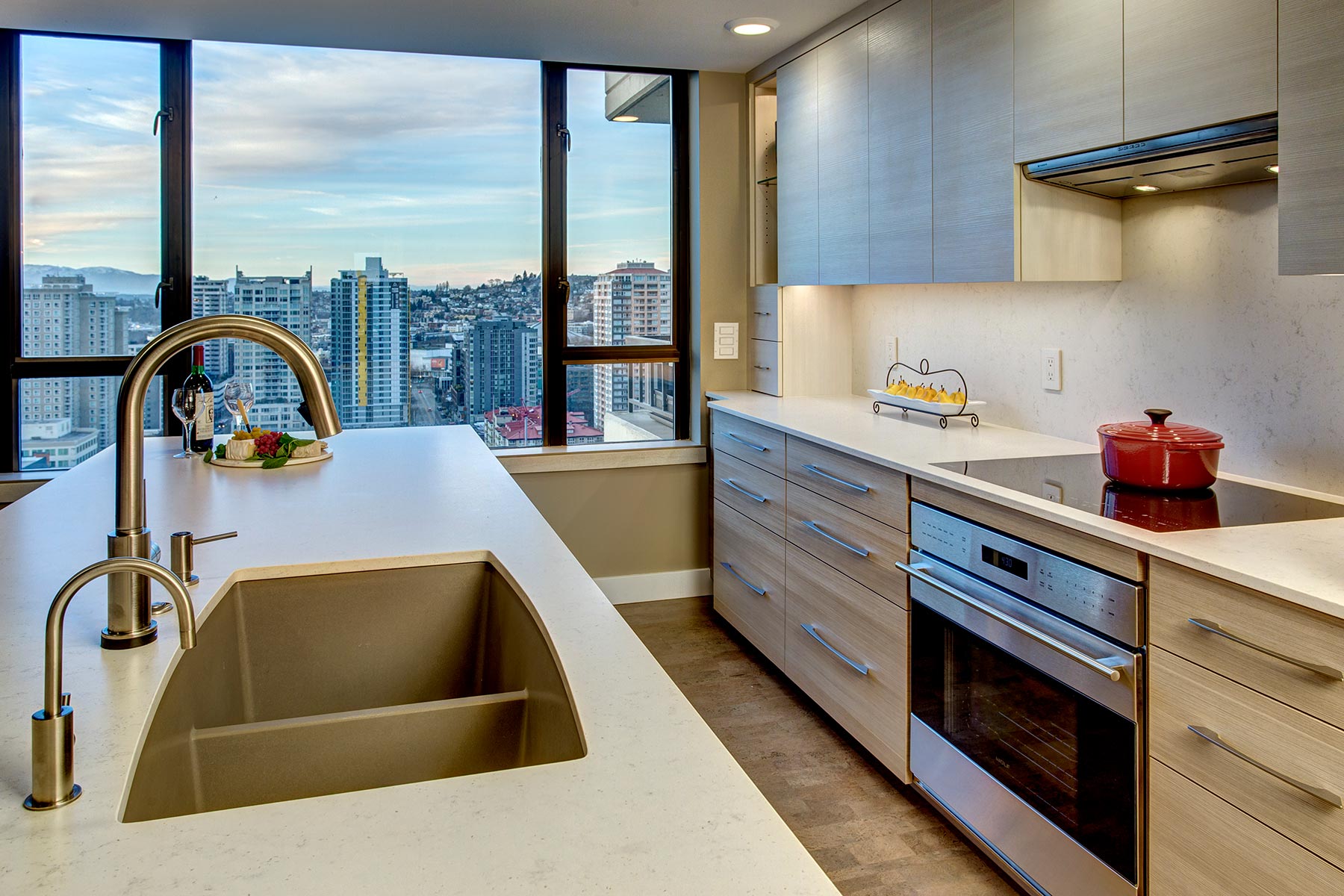
To capitalize on the generous window expanse the project materials were selected for their contemporary styling and to perform well under the impact of such abundant sunlight. The appliances chosen met the client’s culinary needs, and the layout design added work space/storage while still creating an open, airy atmosphere.
- Remove wall between kitchen & dining
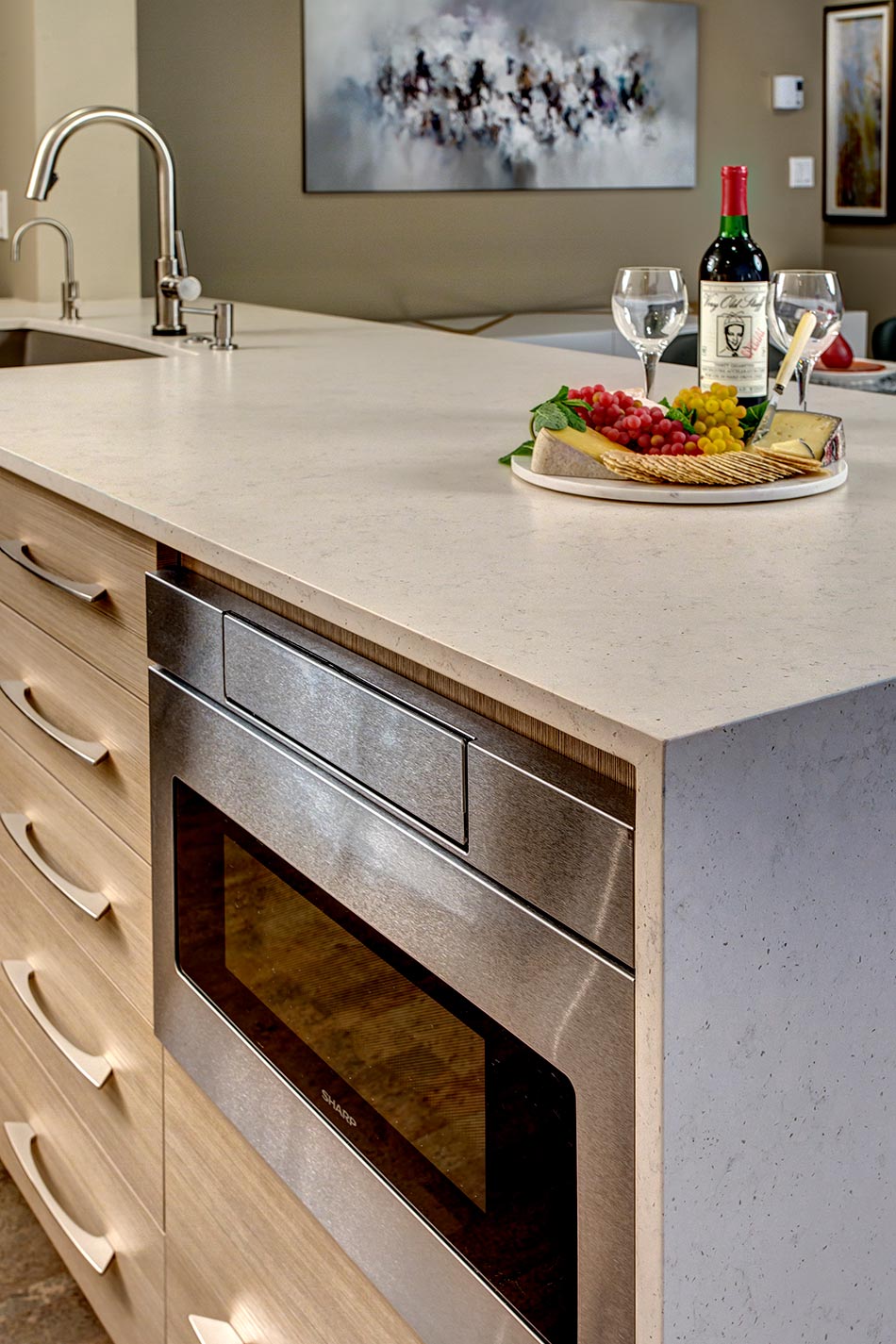
- Create two-sided waterfall peninsula
- Raise ceiling
- Improve traffic flow
- Avoid obstructing view
- Improve lighting/heating
- Increase counter space/ storage
- Add culinary excellence
- New flooring
- Clean lines, sleek profiles
- Quiet appliances/ fixtures
- Elevator capacity, narrow hallway with turns
- Association regulations, approval requirements
- Infrastructure for adjacent floors
- Concrete floors, ceilings
- Window location interference: cabinet layout
- Influence: natural light
- Construction
- Obtained association approval: all plans/materials
- Design cabinetry & counters to fit elevator & navigate hallway turns
- Raise ceiling
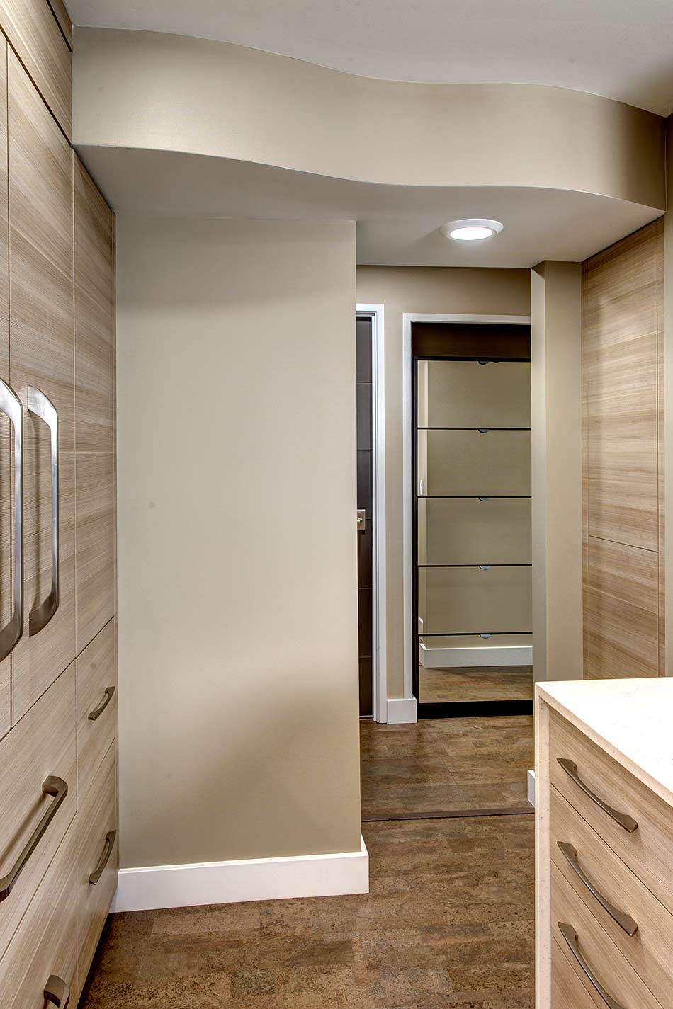
- Design curved soffit: vent ducting
- Increase galley kitchen width: borrow sqft from open dining
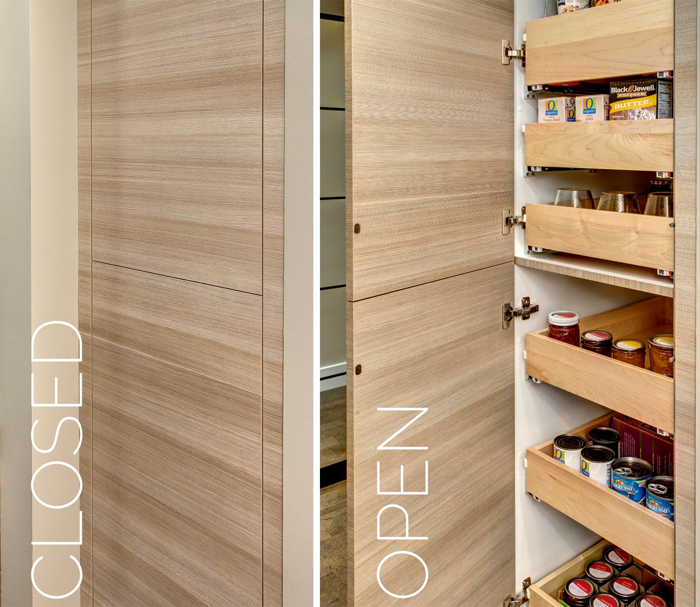
- Add second pantry area: borrow sqft from adjacent closet
- Flooring
- Cork flooring: minimize noise transfer between floors, add softness (physical/visual)
- Color: coordination with cabinetry
- Selections to avoid window shine/glare
- Counter, waterfall, backsplash: suede quartz
- Hardware: Touch-latch & satin nickel
- Horizontal-grain laminate: matte finish, textured
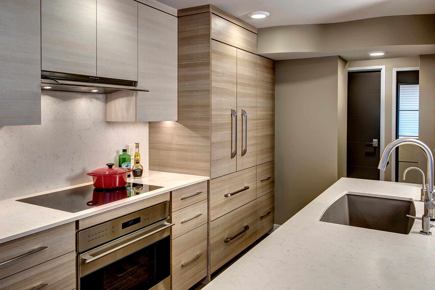
- Refrigerator: panels
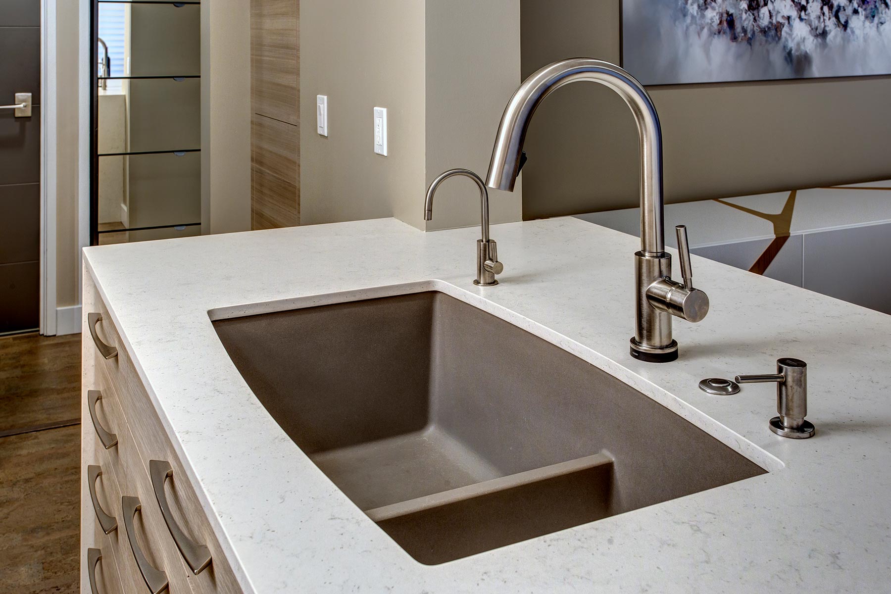
- Sink: Silgranit®
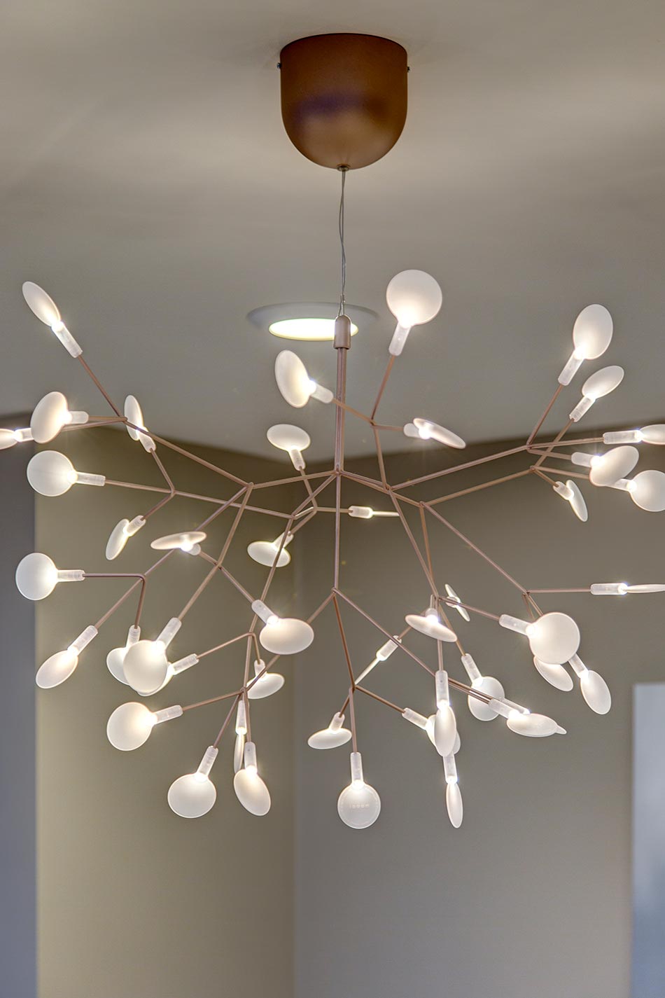
- Chandelier: matte
- Cork flooring: matte
- Appliances
- Microwave drawer: out-of-sight
- Flush installation
- Raised flooring under refrigerator: ensure horizontal match with cabinet drawers & Liebherr freezer drawers
- Slide-out range hood
- Flush inset installation: induction cooktop
- Hidden-control, slim-line dishwasher – quiet rating 46dBa
- Function
- Peninsula (enlarge width & length) – waterfall on both ends: increased work space (remove raised-eating-bar)
- Increase width in galley kitchen, reduced bottleneck
- Reposition work stations: improve traffic flow
- Electrical
- Upgrade wall-heater
- Surface-mounted LED lighting
- LED under-cabinet and in-cabinet lighting
- No pendants over peninsula
- Open-structure chandelier over table
- Cabinetry
- Two colors: textured, horizontal-grain laminate, visually increases kitchen width & height
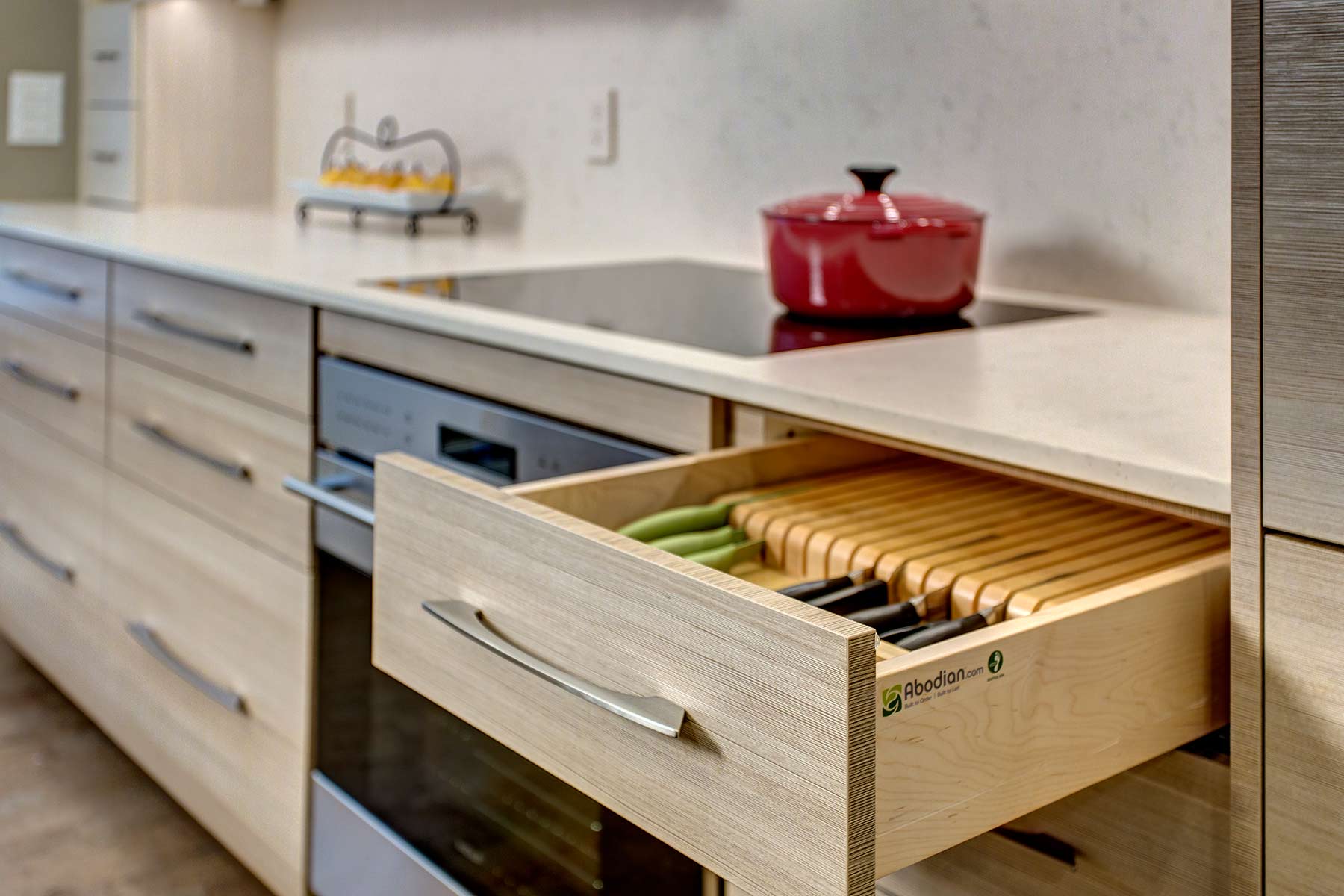
- Touch-latch hardware for wall cabinets, linear hardware on base cabinets
- Inserts: knives & spices
- Roll-outs: pantries
- Reduce cabinet depth at window: coffee/tea storage & display area
- Take cabinets to ceiling: minimal flat ‘crown’
- Fixtures
- Disposal: SoundSeal®, QuietCollar® Bafflel
- Faucet: TouchSmart®
- Social Impact
- Reused cabinets, appliances, fixtures in summer cabin
 Awards
This project received 2 awards in 2016 NKBA Puget Sound Chapter 2nd Place Small/Medium Kitchen and 2nd Place MBA REX/T-REX.


Gail’s favorites: matte quartz counters to reduce glare, horizontal-grain laminate cabinets for a serene sensation, perfect chandelier for styling and openness, cork floors (soft & quiet).
Sugar Candy
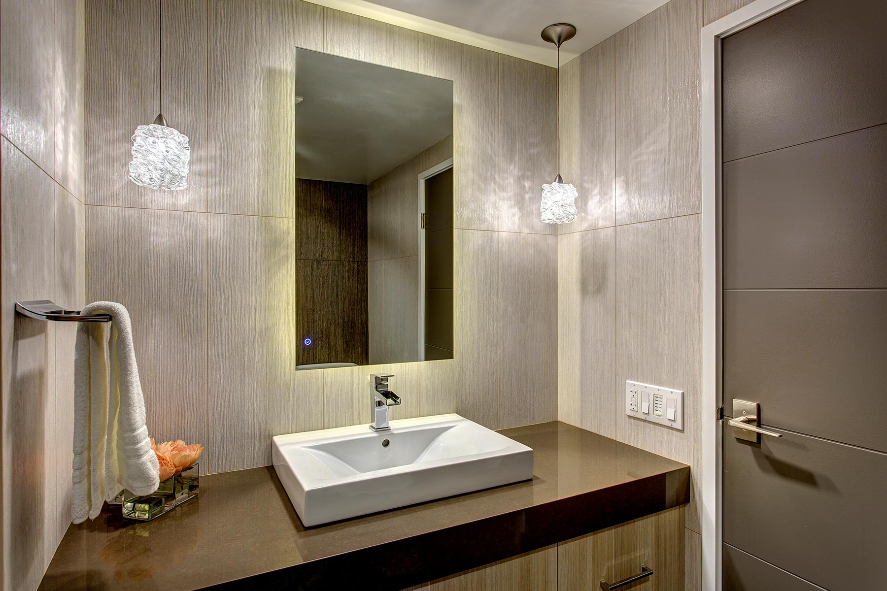
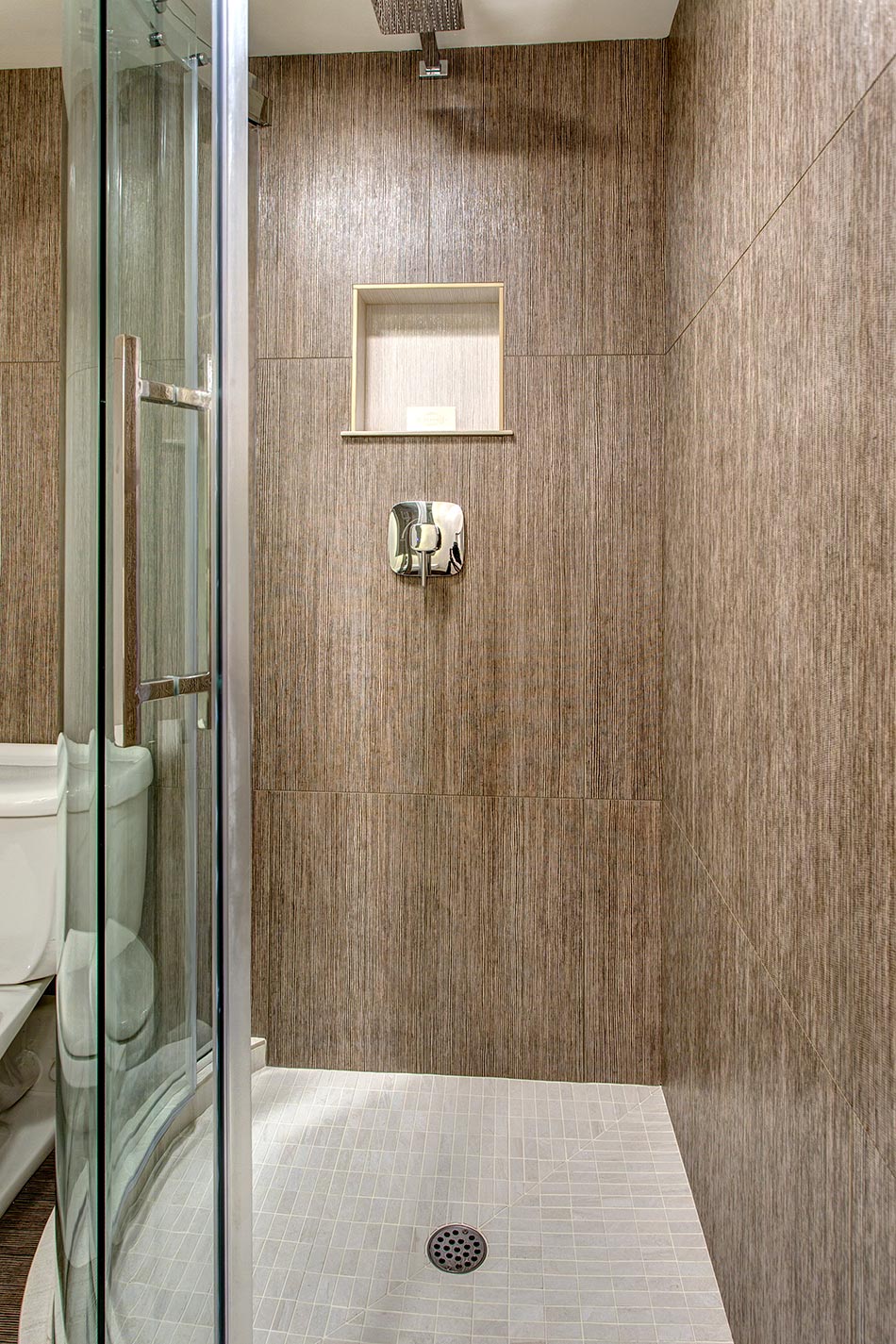
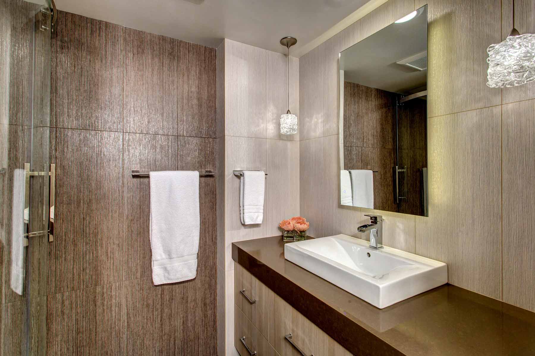
This small, cramped, windowless ¾ bathroom with outdated décor needed a fresh new look. The curved vanity counter and corner shower system both took up valuable square footage. Serving as a bathroom for overnight guests as well as a powder room for all guests, it was uninviting and old-fashioned.
Constrained by the boundaries of the existing condo bath footprint and infrastructure, this complete remodel begged for selections to make it function better and create a larger presence. The shimmering wall tile anchored the design.
- Stay within existing footprint/infrastructure
- Total remodel
- Add/improve light
- Make room feel bigger
- Make room less warm
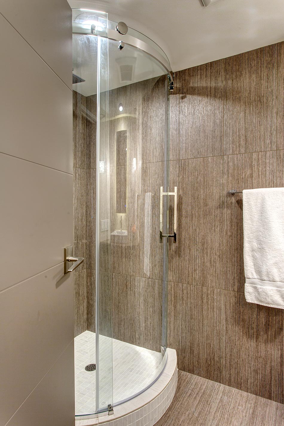
- Improve functionality/design of shower
- Add shampoo/soap niche to shower
- Improve traffic flow (limited by curved counter and shower layout)
- Improve moisture removal plus quieter ventilation
- Association regulations for condo tower building, approval requirements
- Concrete floors, ceilings
- Shared solid wall with elevator shaft
- Moving shower drain
- Shower system to fit available space
- Fitting shower glass system into room
- 1983 high-rise not built to today’s building codes/allowances
- History of remodel toilet failures in building
- Construction
- Obtained inspection waiver for allowances not to current code: grandfathered/approved
- Submitted all plans, materials, sub-contractor information to Association for approval
- After research/consultation, existing toilet kept in place – tiled around
- Concrete floor leveled
- Low profile Whisperfan installed; increase cfm to 80
- Duct work cleaned
- Shampoo niche located on valve wall; adjacent solid wall shared with elevator shaft
- Sourced lower height shower enclosure system – was discontinued, but able to locate one remaining unit
- Not able to move shower drain
- Selections
- Overall goals: make room look bigger & function better
- All four walls tiled floor-to-ceiling
- Contrasting wall tile colors
- Textured tile (vertical grain) to reflect/add sparkle to light from candy pendants
- Floor tiled in same color as majority of walls
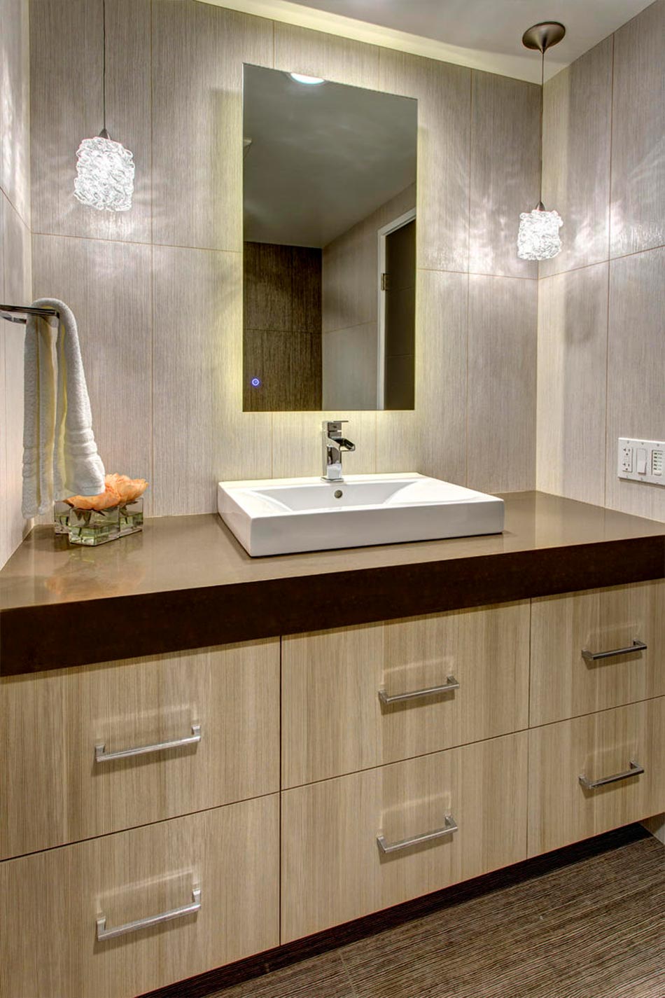
- Floating vanity with drawers
- Wet-rated shower floor tile; use large format tile to simulate slab appearance on curb top
- Electrical
- All LED lighting to reduce heat build-up
- Water-proof light added to shower
- Low profile celling light added over sink center
- Decorative pendant lights that sparkle and reflect onto the tile
- Back-lit mirror
- Vent timer
- Light dimmers
- Cabinetry
- Textured, vertical-grain laminate coordinates with wall tile
- Drawers for sleekness
- Center drawer interior split around plumbing, added storage room
- Counter
-
- Mitered quartz 4” apron edge
- Dark color; contrast
- Fixtures
-
- Waterfall trough; interest
- Single control faucet; simplicity, size
- Chrome; sparkle
- Shower enclosure; sliding door panel (takes less room than prior swing door)
 Awards
The small/medium bath titled ‘Sugar Candy’ received received 2 NKBA awards in 2016. NKBA Puget Sound Chapter 2nd Place Small/Medium Bath, and a Honorable Mention at the national level.


Gail’s favorites: floating vanity, shimmering vertical-grain tile floor-to-ceiling in contrasting colors, candy pendants, backlit mirror, shower enclosure.
Silk & Baubles
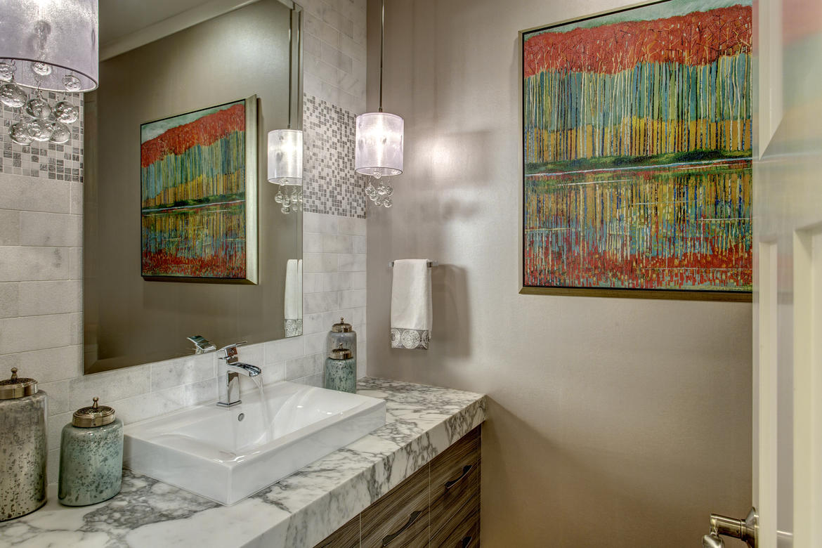
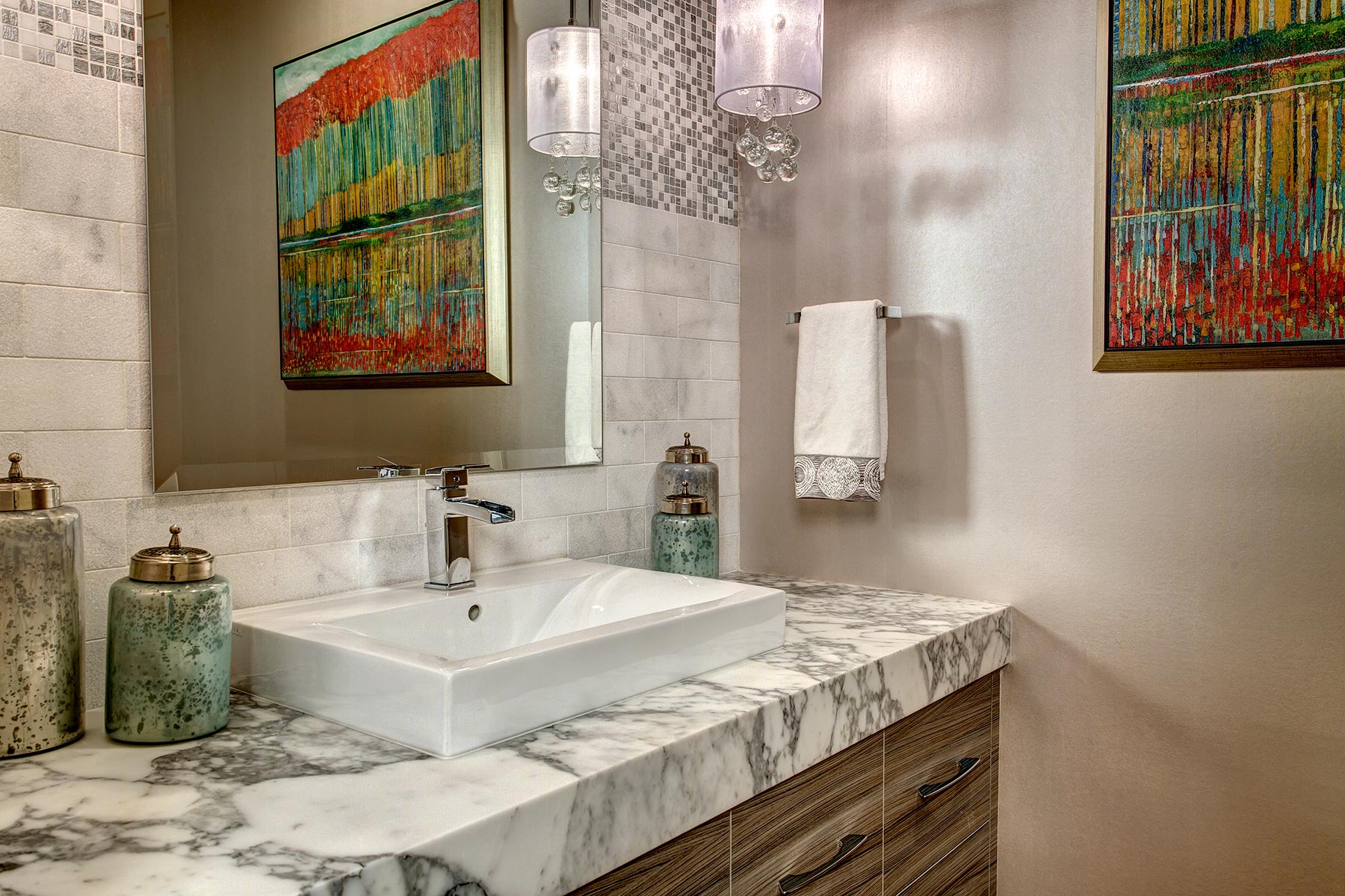
Though less than a decade old, the powder room had a somewhat generic approach, heavy on traditional styling with tons of decorative trim. Everything in the room worked (except the toilet), but it was not to the taste of the new owners, and it all had to go.
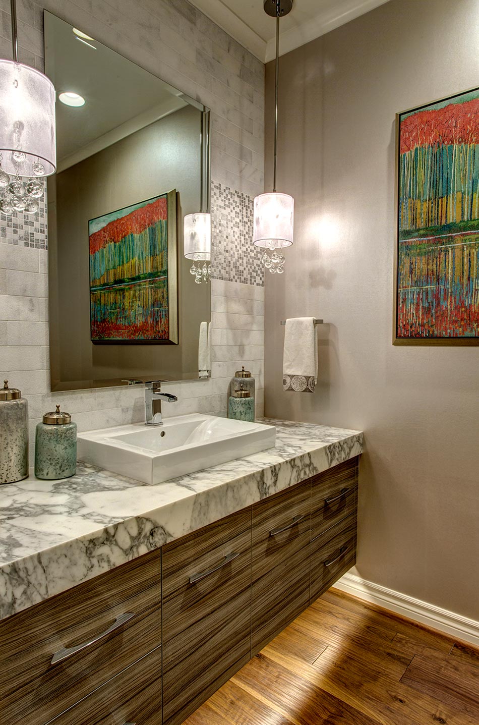
The new look was designed around the tricky task of intermingling contemporary with traditional elements so it would blend with the existing traditional rooms. A combination of textures based on a limited pallet of two colors created a contemporary feel while still retaining some of the traditional elements already in the home.
- Stay within the existing footprint
- Total remodel
- Reduce the amount of traditional trim work
- Add/improve light
- Add a focal point
- Soft, contemporary appeal
- Make room feel bigger
- Quieter vent fan
- Better functioning toilet
- Finding the perfect lighting fixture for client
- Changing the style of powder room while still having it blend with the more traditional rooms in the home
- Identifying the right lighting focal point
- Sconces of any kind were off the table for client
- Ceiling hung pendant featuring glass was appealing
- Silk shades added softness for a powder room setting
- Coordinate with existing traditional rooms
- Remove wainscoting, base, crown, mirror trim and wallpaper
- Add simple 4in. crown molding/Demre ogee in 3 1/2in. base
- Install same flooring as foyer: hand-scraped walnut
- Fabricate Calacatta Cervaiole marble counter; traditional stone
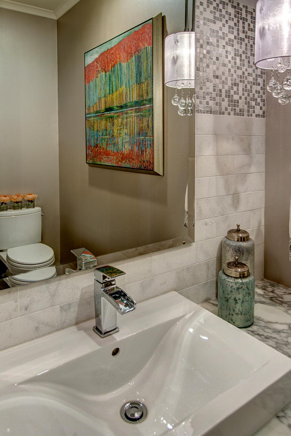
- Rectangular semi-vessel sink blends contemporary and traditional styles
- Wallpaper three walls with a soft textured gray paper that feels and looks like a silk fabric
- Vanity wall is tiled with blasted white stone subway tile installed floor-to-ceiling on the vanity wall
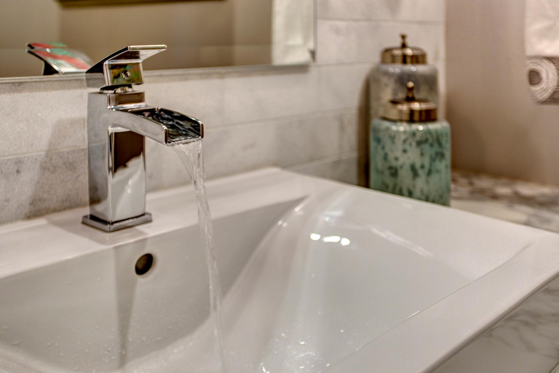
- Chrome fixtures reminiscent of the past, yet currently in vogue
- Ceiling mounted pendants softened with silk shades and glass baubles
- Add a touch of contemporary
- Single control faucet in chrome
- Mosaic deco (silver/white relief mosaics) inset on subway tile wall
- Simple floating beveled mirror
- Mitered 4” apron vanity counter
- Wall art – client LOVES color and botanicals
 Awards
In 2017 this project was awarded 2nd Place – Powder Room / NKBA Puget Sound Chapter.


 Award Winning Projects